
Do you create or design your own content? Even if you are not & outsourcing the designing part of social media, there are some things that you probably should know about what makes a design look bad.
It’s not easy to create a good design. Good design is subjective which means what looks good to me may not look good to you. But on the other hand, when the design looks bad, it is most probably obvious.
That is why it’s a good strategy to avoid bad designs!!
And that’s the purpose of writing this piece.
I’ve listed out some common design mistakes that content creators and digital marketers make while designing social media graphics. Even if you are not a designer, these mistakes shall help you in what to expect from your designers.
Also Read: 15 Best Graphic Design Tips For Creating Social Media Visuals
So, let’s get into it:
Hey, you said design mistakes, right? And how come copywriting comes up here??
Yes. I said design mistakes. But let me explain.
By copywriting, I don’t mean the post copy, I am talking about the creative copy aka “the text on the social media creative”.
Whether you have a copywriter or you write copy on your own, you should always make sure the text is as short as possible in the designs but still provide context.
You don’t want to overwhelm your audience on social media by putting too much text, too many CTAs, and overwhelming details about offers, sales, products or services, etc.
‘What you write’ and ‘How you present’ that writing matter a lot in making the design look attractive on social media.
Note: I’ve written a full-length article on how to overlay text on images.
After all, ‘Visuals’ and ‘Bold Headlines’ are the two key things that people get attracted to on social media and might make them stop the scroll.
For example, look at this Instagram ad I got served the other day:
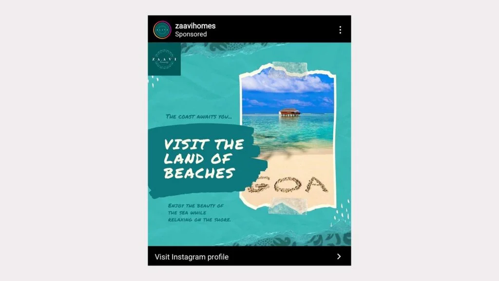
I like the way how the key text (my first focus was on that) was written big with a shorter length copy and they clearly made their point with this ad.
Now making the text shorter is very important to appeal to the audience.
But that doesn’t mean you’ll reduce the size of the text way too little to focus on the visual or increase the size way too high to dominate the visual.
The goal also here should be to make sure you account for the smaller device. No one uses Instagram and Facebook on their laptops (I mean very few do).
The size of the text has to be based on the visual hierarchy. That means big sizes for the headings and small sizes for the body text.
Also Read: 5 Powerful Typography Tips To Craft Beautiful Social Media Graphics
And make sure the fonts you choose for heading and body text complement each other. Not sure, what does that even mean? Not sure how to pair fonts? Here is an article for you.
Also Read: 15 Best (FREE) Fonts For Headings In Social Media Posts
Just because you want to make the design look good doesn’t mean you fill it up with all the design elements like abstract shapes and patterns.
Leave some space. In other words, use whitespace. Didn’t get it?
Whitespace is basically the empty space around the key elements of the design. Some free space around the text and image will let your designs breathe.
So, always design keeping whitespace in mind. But, why is it so important?
The whole point of using whitespace (also called negative space) is to drive the viewer’s focus to the positive space, aka the text and the visual.
Viewers don’t have to stress out to find the information they are looking for. Remember that attention is the new currency and it’s very scarce.
We should always want our audience to consume content with the least effort possible. If we are making it harder, it’s hard to find a place in the attention economy.
Do you have multiple design templates ready for multiple content types? Like a specific design template to promote products, a specific design template for all the announcements, etc.
No? Then it’s very hard to maintain consistent visual branding.
Look at how brands are using similar design styles in multiple posts:
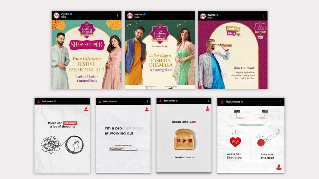
Use similar styles consistently. Because that’s how you make your audience remember your brand, visually.
If you are someone who uses photoshop to design templates, I’ve got an article for you to refer to.
Final statement: Create templates for content types that you post on your social media regularly: Testimonials, announcements, etc.
Alignment, distribution, and hierarchy are 3 very important design principles that you need to consider when designing social media posts.
Instead of going through what each of these in pure design terms, I’d like to explain via some design examples.
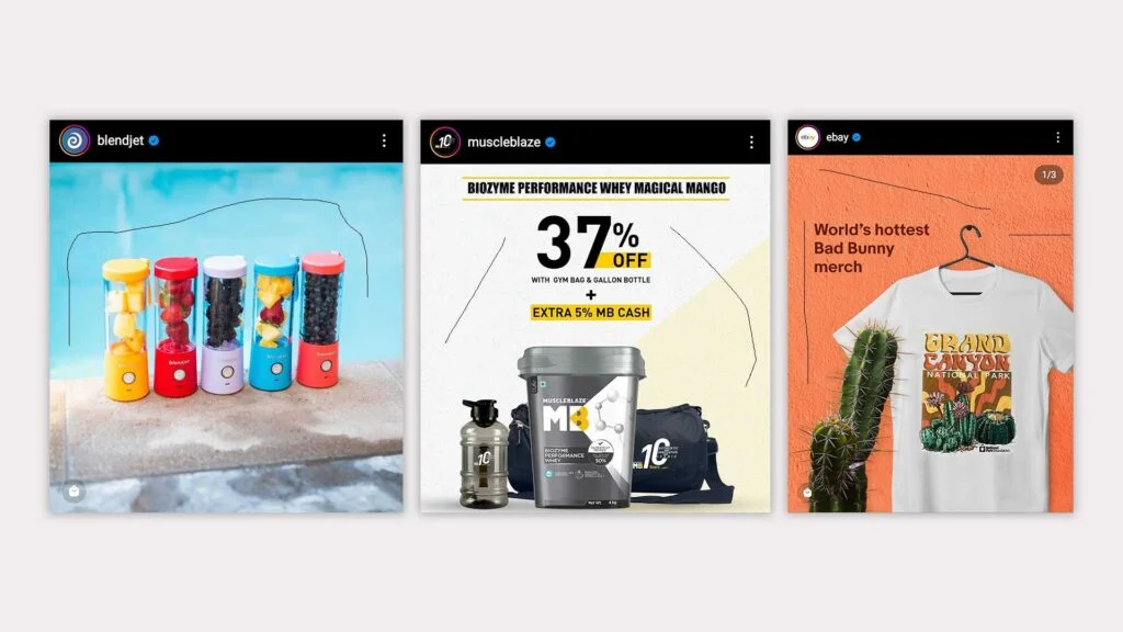
In the left design, the first thing that you’ll notice is the word “Free” or the visual. But there is no way you’ll read the remaining text first. And on the other hand, you’ll notice the “Visual” first on the right side design (Image Above).
That’s Visual Hierarchy! Designing elements in such a way that you have the ability to drive the viewer’s focus.
Also, look at how the text and visuals are aligned, and how the space is equally distributed between the lines. I don’t think I need to explain it further.
What’s the point if it looks attractive yet clumsy?
Always aim for clean designs. And the first step to achieving that is knowing that all design elements shouldn’t be treated equally. More elements don’t necessarily lead to better design. In fact, it’s the opposite in many cases.
Using a lot of whitespace and colors with better contrast helps a lot when it comes to creating minimal designs.
Finally, just because you are a designer doesn’t mean you have to add a lot of elements.
Here are some more tips to make sure you keep creating awesome-looking designs:
Design plays a very key role in social media marketing.
So if you are constantly improving the quality of the social media graphics (by avoiding these design mistakes) then you are improving your marketing efforts automatically. That’s all I can say.

