
Text plays a key role in social media designs. After all, we use social media to communicate the message to our audience. And fonts determine how good the text looks.
But the real struggle comes when we have to pair fonts. Don’t worry!
Because I have brought you the list of 21 “already working” font pairs that you can use in your social media graphics.
But before that, I want you to know some things about pairing fonts (I’ve already talked about this in the typography article. You can check that for some in-depth typography concepts and tips).
Pairing fonts ain’t an easy task. But there are some rules (or hacks) that you can follow. Before that, I want you to have a clear understanding of what the basic font categories are and what they represent.
Serif: Safety, History, Tradition, Respect.
Sans Serif: Clean, Clear, Minimal, Friendly.
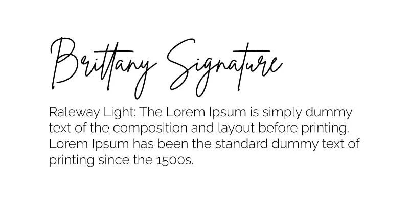
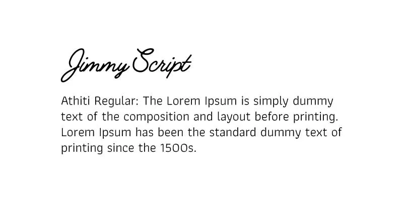
Script: Feminism, Elegance, Personal, Unique.
Display: Big, bold, and quirky fonts that are mostly used for headings. Best for small amounts of text.
Every font has a personality and a certain message it conveys. Just consider the purpose of the font in the design. Is it to show feminism? To attract viewers?
Is the font needed for the body text? Ask yourself these kinds of questions when deciding what font to use.
Now, let’s get to the rules.
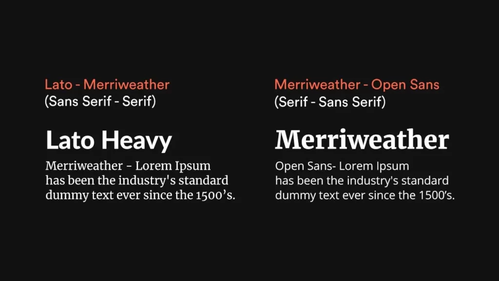
–> Pair a serif and a sans-serif font. Use a serif font for the heading and a sans-serif font for the body content. Or vice versa.
–> Pair a bold font with a lightweight font.
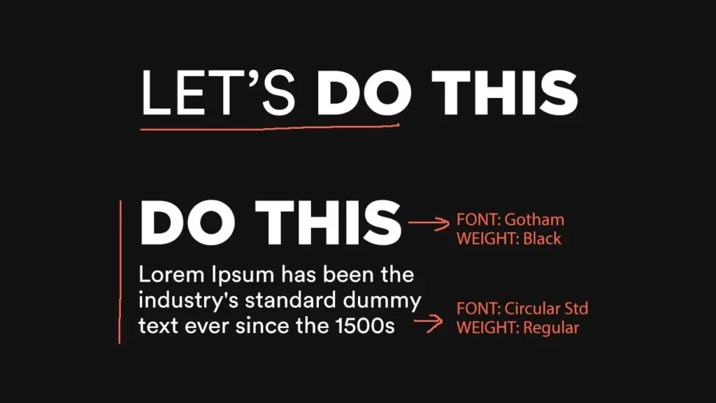
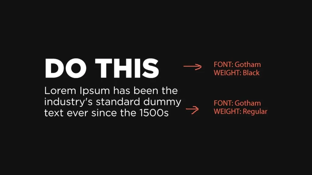
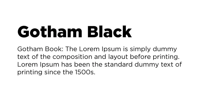
–> If you are struggling to find fonts that complement each other, pair fonts within the same family with different weights. And skip a weight when choosing fonts from the same family to create a typographical contrast in the design. Gotham Black & Gotham Regular.
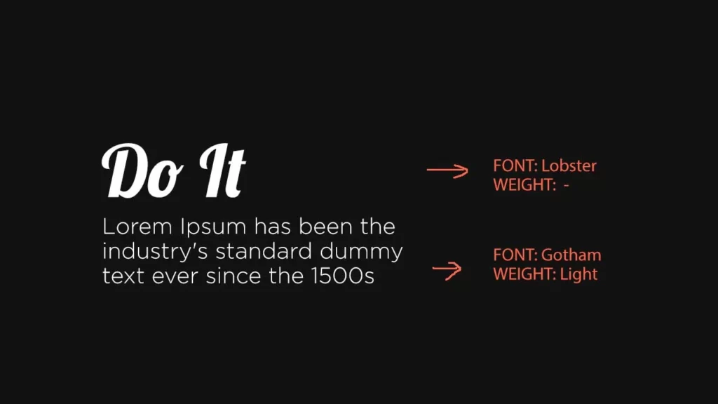
–> Pair a decorative font with a simple font. In the image below, I paired Lobster(script font) with Gotham Light.
Basically, the simple formula here is opposites work well in font pairing. Simple with bold, serif with sans serif, etc.
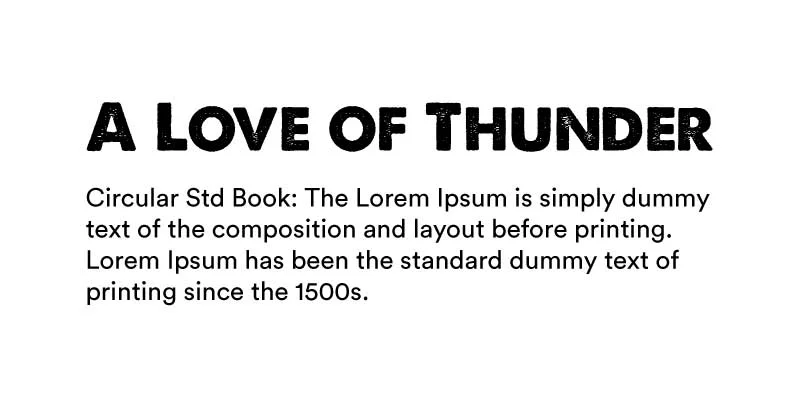
For example, I use the sans-serif font: Aku & Kamu (for headings – Bold) as the main font. I pair that with another quality sans-serif font with a strong geometric type “Circular Std” (body text, subtle, minimal) in most of my designs.
Although both the fonts are sans serif fonts, the pairing worked because I paired a bold one (Aku & Kamu) with a lightweight one (Circular Std Regular). If you are using fonts from the same family, then play with weights.
That’s it about fonts. But here are some things that I don’t want you to do while pairing fonts:
It’s all about finding a pair that looks appealing. And it shouldn’t look something like this: (A height weight one paired with a display font (which is also a heavyweight one).
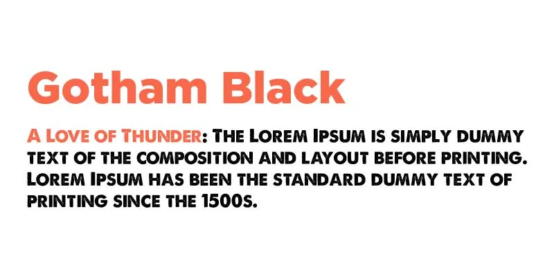
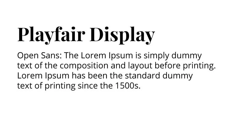
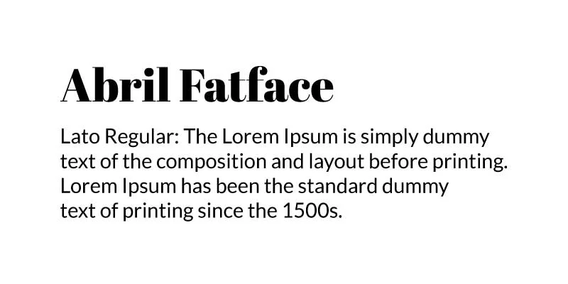
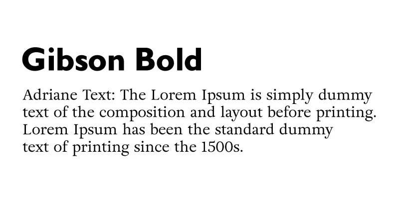
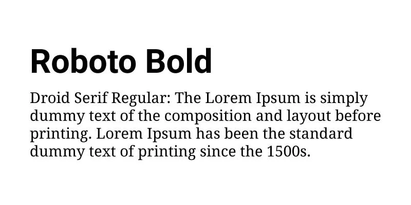
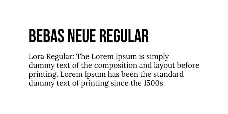
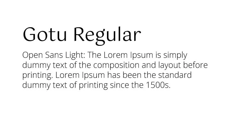
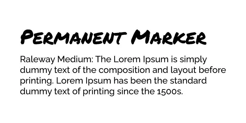
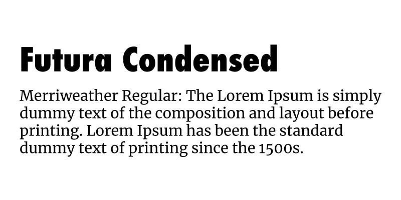
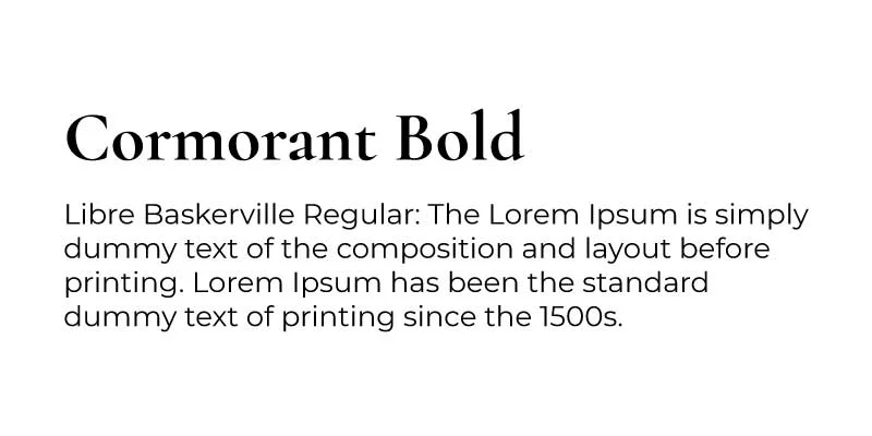
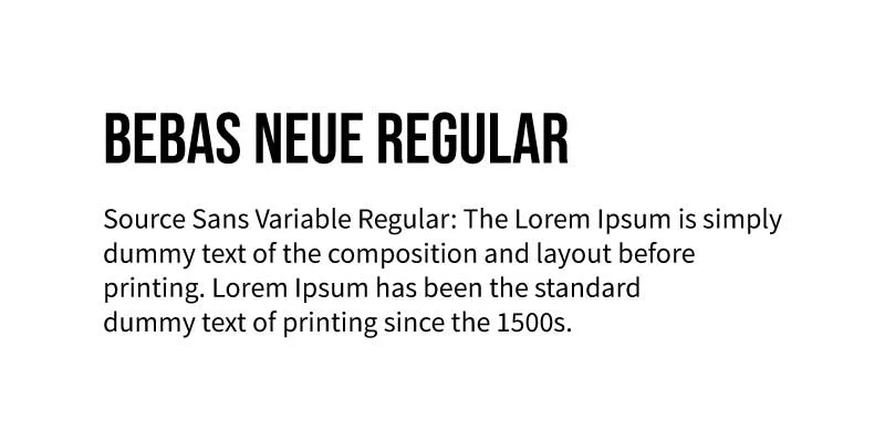
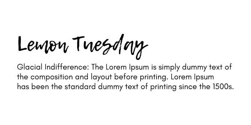
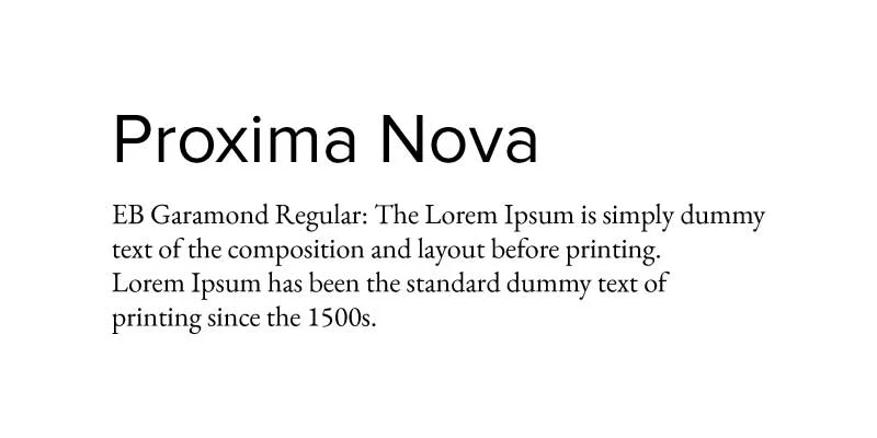
Here is a list of some font combinations for your next social media design:


Typography Tip: Don’t use a script font in the upper case.
Now that you know how to pair fonts, and what font combinations should be like, and you have the list of some best font pairings, it’s time to start using them in your designs.
Let me know how’s that going and also comment on some more font pairings that I’ve not mentioned in this article.


3 Comments
15 Best (FREE) Fonts For Headings In Social Media PostsAugust 6, 2021
[…] Related Article: 21 Best Font Pairings For Your Social Media Designs & Graphics […]
Oliver WoodAugust 6, 2021
Really awesome! very informative and authentic information. All these fonts are very classic. I seriously liked Roboto Font. Keep up with good work.
Thanks for finally writing an informative article.
5 Common Design Mistakes To Avoid On Social Media – Social Media DesignedAugust 6, 2021
[…] And make sure the fonts you choose for heading and body text complement each other. Not sure, what does that even mean? Not sure how to pair fonts? Here is an article for you. […]