
We know that a good visual or design can help in conveying the message to the audience. Putting text on images is very common in any kind of social media post because the intention behind posting something on social media is to convey a message to their audience.
Like this post by Amazon India.
Amazon is talking about their offer in this post. They’ve put a lot of text in the design, but each sentence has its own importance in terms of how a user reads the text.
Whether it’s a quote post or an offer post or a product post, there’ll be text on every social media post unless if you are posting only images like what Apple does(mostly). So learning some design techniques to place text perfectly on images can be very useful if you are a designer like me.
So, yes I am gonna explain to you 5 different and best ways to design photos with text overlays.
Caution: I’m gonna explain how to use these techniques via Photoshop, but you can use any other design tool and apply these principles.
Also Read: How To Design Social Media Posts: The Complete Guide To Designing Stunning Graphics
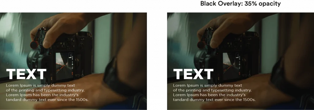
In general, if the text is bright then add a black overlay, and if the text is dark then add a white overlay to the image.
Birght Image –> Dark Font –> Bright Overlay &
Dark Image –> Bright Font –> Dark Overlay (see the image below).
But you can add any color. Like this (green):

So the process here is just adding color behind the text and above the image. Adjust the opacity of the color layer as you need. So simple, right?
But that’s basic. Have a look at this Instagram fitness post that I have designed (the image on the right corner is the final one).
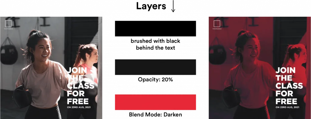
Yes, a lot happened here. Let me make it simple!
I have added a black background with 20% opacity below the text. And I chose red (I assumed it’s the brand color) and added behind the black layer and set the blend mode to Darken. I still feel the text isn’t highlighted, so I painted a black color (very low opacity) behind the text.
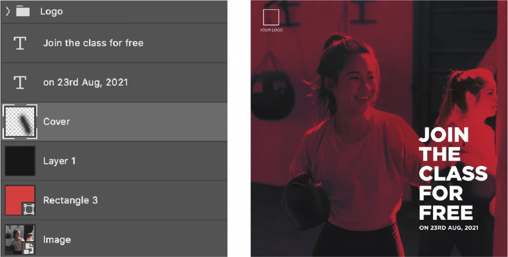
So the layer stack goes like this:
If you experiment with the blend modes of the color and choose the black or white color overlay with low opacity, you will get the perfect design.
And you can use gradients too!

Most of the time we use an image to convey a message visually. So this technique of blurring an image is not always recommended to write the text on the image. But if the blur in such a way that one can figure out what’s the image is all about, then you are good to go.
Applying a blur creates a space (Not literally. Just a feeling) between the blurred image and the text. And so the text appears a bit highlighted.
Tip: A Gaussian blur of radius 3px to 10px is optimal.

Note that along with blurring the image, I have used similar effects (or layers) that I have used in the previous one.
A visual asset is nothing but a graphic element. Using graphic elements to highlight text is one of the best ways to emphasize textual content.
Have a look at this food banner.

I have used an orange rectangle behind the text, to highlight the text. And the opacity value is around 70 (I think).
But how is this different from Color Overlay? We are just working around the textual content here. And we can still see the original image here unlike in the Color overlay process.
Here is another example on how to use visual assets to emphasize text.
And it’s ok to go crazy with the shapes and elements!
This process comes in handy when you don’t want to mess the image with any color overlays or maybe for whatever reason you don’t want to use any visual assets. Then you can add a drop shadow to the text.
In doing so, it will become easier to read. Like in the women’s day post below (I have designed for a vehicle rental startup. I used to work there). I have added a drop shadow to the text “To all out Road-Queens”, which makes it more visible despite huge brightness because of the sun.

It is not something I use more often, but a good way and the easiest way to highlight text.
I use this technique more often when I need to include more text on a social media post. In that case, instead of manipulating the text, just manipulate the image.
Like this one.

In this post, I have reduced the size of the image and put it in a white box. And filled the remaining space with blue (brand color) so that I’ll have enough space to fill the content.
So instead of adding graphic elements to the text, I have added a graphic element (white border) to the image.
Putting text on social media posts is very crucial in the design process. I hope these 5 techniques will help you to create better social media graphics.
8 Comments
How To Design Better & Clickworthy Youtube Thumbnails + FREE PSD TemplateJanuary 21, 2021
[…] A good thumbnail is all about marrying text with images perfectly. […]
How To Design And Use Quote Posts In Your Instagram Marketing StrategyJanuary 21, 2021
[…] can write the text on the image, which is what almost all quote posts are about. But I want to choose a background as a solid color […]
How To Design Social Media Posts: The Complete Guide To Designing Stunning GraphicsJanuary 21, 2021
[…] Pro Tip: Try to limit the number of fonts used on a post to 2, vary font weights as many as needed. And to learn more about how to overlay text on images perfectly, go here. […]
8 Powerful Designs Tips To Create Eye-Catching Visuals For Social MediaJanuary 21, 2021
[…] For an indepth explaination on these 5 tips, go here. […]
How To Create Social Media Posts In Photoshop: Beginners GuideJanuary 21, 2021
[…] in this case, what I will do is, I’ll choose an image as the background, and then I’ll write text over the image in the best possible way to convey the message. Let’s […]
5 Powerful Typography Tips To Craft Beautiful Social Media GraphicsJanuary 21, 2021
[…] to the space between individual letters. But this option didn’t help me much in terms of putting text on social media posts. If you want to know more about Kerning, you can refer to this […]
15 Best Graphic Design Tips For Creating Social Media VisualsJanuary 21, 2021
[…] I don’t think you’ll get the full picture of what I’ve said in the 5 points above. Don’t worry. Read this article: 5 Best Ways To Add Text Over Images In Social Media Posts […]
5 Common Design Mistakes To Avoid On Social MediaJanuary 21, 2021
[…] Note: I’ve written a full-length article on how to overlay text on images. […]