
Social media is visual. There is definitely no doubt about that. And the platforms are getting more and more visual. Maybe that’s the reason why Instagram is the fastest-going social network out there.
The key thing that we should know is people are hardwired to respond more to visuals rather than text. Visual content is getting more and more attention from marketers. Because that’s what people are paying attention to.
But, not all visuals get attention. Nowadays everyone is using them. Only well-designed visuals can get through the clutter and convey the message to your audience. It has become “the survival of the best” on social media when it comes to content and design.
If you want to know how I design social media posts from the scratch, you can read this article.
In this article, I’m gonna give you the 15 best graphic design tips to make your social media accounts and content more appealing to your audience. So, let’ start.
What text you put on the design is important. But how you present that text is equally important. After all the goal is to convey the message easily, right?
The best way to make people read your content is to make the text (or at least the heading) shorter and sexier. How? Eliminate words and use a display font or your own brand fonts with the highest weight.
For example, instead of writing “The health benefits of Cacao and 4 ways to use it”, they wrote, “Cacao Power” in a short and sexy way. And the remaining details are added to the next slides.

Note: Text and Visuals are the only two scroll stoppers. Make sure you use them the right way.
All marketers understand the importance & efforts needed to create more content. So they repurpose content. But don’t forget to resize your content.
The size that suits Instagram might not suit well for Facebook stories or LinkedIn posts or a Pinterest pins. So resize graphics according to the social platforms you are using to post content.

Related Article: How To Resize Social Media Graphics & Images In Adobe Photoshop
Make it easy for your audience to consume content. By posting in the right sizes, you can make it easy to consume content.
This is the last step of the 6 step design process I follow to design social media posts. By branding elements, I mean adding your website, contact details, logo, and any other important details.
Don’t add everything. Add only the necessary details.

Tip: Instead of just the logo, trying adding your business name too so that people can remember it, in the long term.
Where do you want to put your logo on social media graphics? What kind of graphics style do you want to follow for your posts? How do you want to use your colors and fonts?
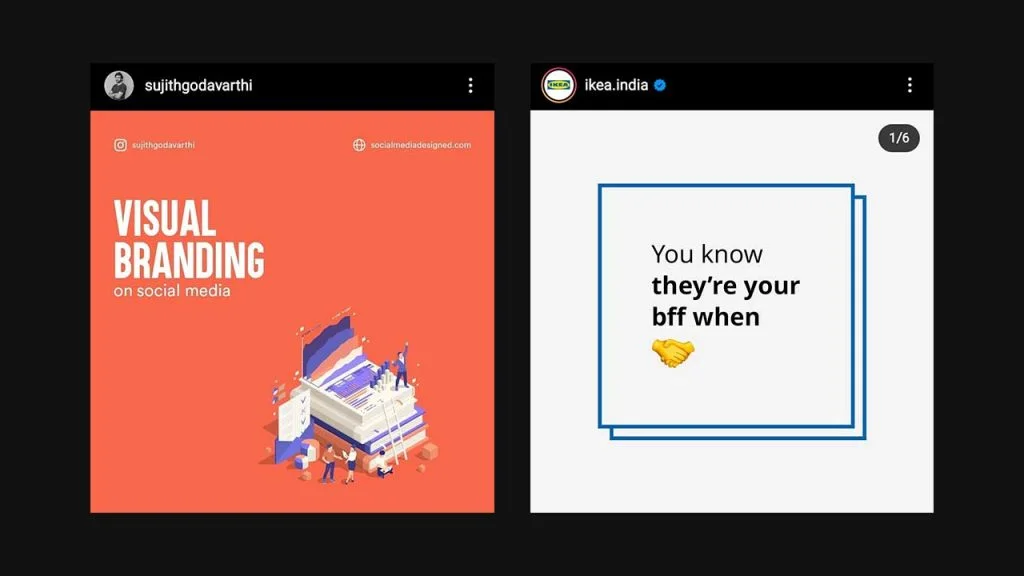
Semrush, a software company uses similar kinds of illustrations in most of the educational content that they share. And they use a variety of colors.
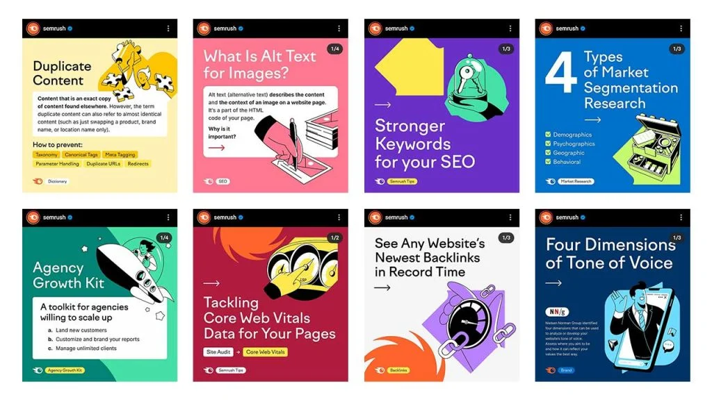
What makes their posts easily recognizable is their usage of eye-popping colors, typography, illustrations style, and logo placement (bottom left).
It’s their style. So what’s yours. Define it.
Related Article: 4 Key Ingredients To Build A Strong Visual Brand On Social Media
Do you have some important or fun data to share? Convey them with infographics. Infographics do awesome work in establishing authority and educating your audience.
This is how Venngage defines what an Infographic is: It is a collection of imagery, charts, and minimal text that gives an easy-to-understand overview of a topic.
Search your old content and see if you have something that is convertible to infographics like tips, tricks, data insights, comparisons, etc.
Try breaking down complex methods and data into simple infographics that are easy to decode and understand.
From real estate agents, local coffee shops to top fashion brands and internet companies, many have made posting infographics part of their content strategy. Here are some examples:

Important: It’s hard to create one infographic fit to all social platforms. So, you need to consider resizing the infographics for multiple platforms. (Tip No.2)
The usage of colors and fonts plays a key role in how well you present the content. After all the goal is the communicate the message to your audience.
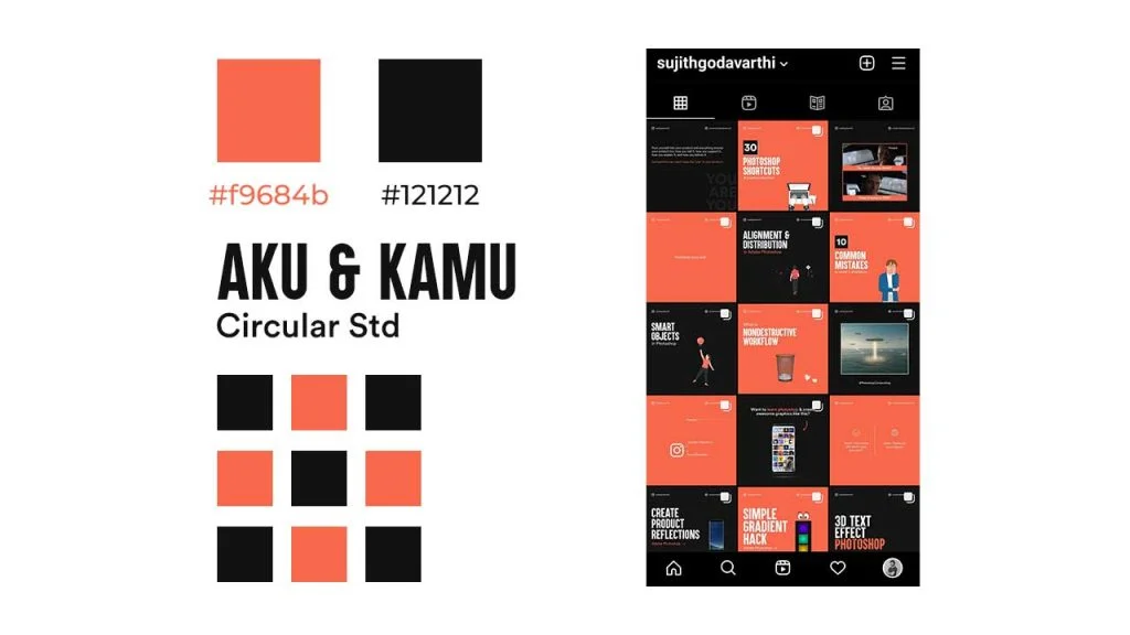
Consistent fonts and colors usage can make people recognize your brand. Like KFC red, Starbucks green, and the simple font (San Francisco) that Apple uses. We can recognize these things easily because they use the same colors and fonts over and over. That’s their visual brand identity elements. What’s yours?
I use the same fonts & colors always while posting content on my Instagram account.
Typography can simply be defined as “The appearance of text”. Understanding the concepts of typography can help you design text in an appealing way.
Some of the concepts that you should learn are pairing fonts, typographical contrast, structuring a hierarchy, how to use leading and tracking, etc.
I know it seems like a lot. But it’s not. I’d recommend you to read this article where I’ve talked about the typography tips you need to know to master putting text on social media graphics in a nice way.
The whole point of creating contrast in designs is to show a big difference between the elements which in turn creates visual interest.
Why do we use white text on a black background or vice versa? To create contrast, right? To make the white pop well on a black background.
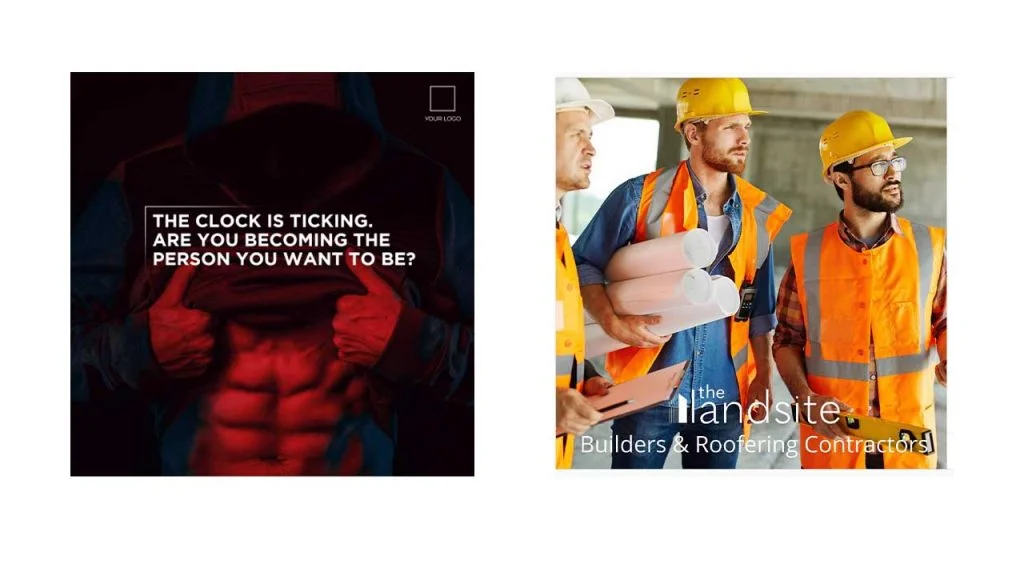
By design with contrast what I mean is to create a social media post in such a way that you use design elements (text, graphics, photos, etc) by creating a visual hierarchy so that the users will know what’s important and what they should read first. Have a look at the below examples:
In the left design, the first thing that you’ll notice is the word “Free” or the visual. But there is no way you’ll read the remaining text first. And on the other hand, you’ll notice the “Visual” first on the right side design (Image Above).
It’s basically understanding what can make the user stop the scroll and then creating contrast around to direct the viewer to see that thing first.
Have you ever wondered why some degins look so clumsy? It’s becuase the one who designed that didn’t know about whitespace.
Whitespace also known as Negative Space is very crucial concept in web designing. But it should be taken care of in any kind of designs you create.
Whitespace is the part or area of a creative where you see nothing but a color. The whole point of using negative space is to drive the viewer’s focus to the positive space where we will be placing the main text/image.
Look at how these two designs below has a lot of empty space. And that’s what makes the message clear. Isn’t it?
There are four key things that can help you acheive visual consisteny: Colors, Fonts, Templates, and, Style. If you keep these things consistent, you’ll definitely create a good visual identity for your brand on social media.
And that’s the reason why always keep the brandning guide with you while designing. That can help you place the design elements according to it.
Once you achieve visual consistency in your designs people would eventually identify your content without even seeing the brand name.
Now that’s a good thing, right?
Extensive use of stock photography might (or will) dehumanize your brand. But there is a right and wrong way to use them. If you are placing the design elements in the right way people won’t care much about the stock photo.
In both these above creatives, stock photos are used. But on the left side, what matters is the quote. That’s not the same on the right side. The text isn’t well placed and since the focus is more on the image and it is also very clear that the image is a stock image, the design isn’t that appealing.
Tip: If you are using stock images, make sure that’s not the first thing people would see on the design.
Just placing the text on an image won’t make the text readable (99% of the time). You need to do something to make the text pop up. Well, there are 5 ways that I can give, but which ones you choose is up to you.
I don’t think you’ll get the full picture of what I’ve said in the 5 points above. Don’t worry. Read this article: 5 Best Ways To Add Text Over Images In Social Media Posts
Templates are great time savers. If you are someone who doesn’t use an online tool, you should definitely consider using some pre-made templates (by you or others). Canva, Snappa, other online tools provide a lot of templates. It’s not that the same if you are using Adobe Suite.
Related: 10 Websites To Find Free Social Media Design Templates (PSD Files)
Moreover using templates for similar content types creates a visual consistency on social media.
Add CTA buttons on the creatives when needed. Although users can’t click on it, they will get an idea of what to do. Whether it can be “Get it now”, “Signup”, etc. design the CTA’s well so that users will understand what you want them to do.
Oh! Only one CTA in a design, please.
You don’t have to stick with the common content types for your marketing strategy. Get creative in your own niche. Tell your brand story with visuals. Durex gets way too creative on social media.
Similarly, you can be creative too, in your own way.
Just because you are a designer or you have more things to say to your audience doesn’t mean you have to add as much as you can to a design.
Limited usage of colors, fonts, and graphical elements can make the design look more appealing and easy to consume.
In today’s overcrowded social media space, you can get through the clutter and reach your customers and prospects with the help of the right visuals. Maybe the only way that’s left. I hope these designs tips helped you.
Good design is subjective. Avoid creating bad designs by following the tips that I’ve mentioned and you’ll get to the right place.
3 Comments
5 Common Design Mistakes To Avoid On Social MediaAugust 3, 2021
[…] Also Read: 15 Best Graphic Design Tips For Creating Social Media Visuals […]
Social Media Marketing For Web3 Products & Companies: Ultimate GuideAugust 3, 2021
[…] you want to deep dive into this area, I’d recommend reading this article where I gave 15 tips to improve your social media […]
Social Media Marketing For Web3 Products & CompaniesAugust 3, 2021
[…] you want to deep dive into this area, I’d recommend reading this article where I gave 15 tips to improve your social media […]