
Using social media has become the new normal for businesses to connect with their customers and prospects.
And social media is getting more and more visual.
What do I mean by the above statement is that it’s hard to get traction if you are not using appealing and beautiful graphics to communicate with your audience.
This got clear from a survey done by Venngage. In that survey, 64% said that visuals were either essential or very important. 31% of respondents believe visuals are quite important or somewhat important for their marketing. Only 9.6% feel that they don’t require visuals for their content marketing.
I think you got the point. Visuals & design matter a lot on social media to get attention which is being considered as the new currency by the marketers.
And at the same time, if no one recognizes your brand, then all the effort that you put into creating and designing the content goes in vain.
But I’m here to tell you that you can avoid that mistake. How? By implementing a strong “Visual Branding Strategy”. This strategy is all about creating good visuals and at the same time branding those visuals (with visual cues) so that people can remember your brand.
So, in this article I am gonna talk about:
Ok, let me define what branding is in the first place.
Branding is what other people think of you, your company, or your product or service. It is what separates you from your competition.
Now, talking about visual branding, it basically means how the brand looks visually – logo, colors, fonts, website, social media posts, packaging design, etc.
So when I say visual branding on social media what I mean is how your visuals on social media look like: profile picture, Twitter header, Facebook cover, Instagram posts, etc. The visuals you use will set a tone and personality for your brand.
And more importantly, the visual cues (colors, fonts, icons, illustrations, etc) should make people remember your brand. For example, you remember the colors of KFC, right?
That’s because you saw the colors many times. No, it’s actually because you saw the same colors (red, black, and white) many times.
The attention span is getting way too shorter in the social media space. That basically tells that it’s getting harder for businesses to get any traction. So you have to get attention fast enough or else you’ll get lost in the fast scroll.
That’s when visual marketing comes in. This basically means you embed branded visuals in your social media strategy that grab more and more eyeballs.
For example, you do remember the colors of companies like BMW, Facebook, KFC, etc. So color can be one of the powerful ways for people to remember your brand and the same goes with the fonts too. We have seen that in the image above.
Visuals are the first thing your customers and prospects are gonna see on social media when they reach you (or you reach them) for the first time.
Although what you are gonna post (content) is way important than how it looks, people are gonna notice the “how it looks” part in the first place. And that makes the “how it looks” partway more important.
This is the reason why graphic designing is getting more important in social media marketing.
So, how can you create a strong visual brand on social media?
From the usage of colors and fonts to embedding styles and themes in your designs, here are 7 key ingredients that can help you master visual branding like a pro on social media.
Do you know that colors can influence a buyer’s purchasing decision? After all, there is whole color psychology behind girls liking pink, most small businesses using blue, etc.
But when it comes to social media, instead of using different colors to convey different emotions what we should be looking for is “consistent usage of brand colors”.
McDonald’s Instagram account aesthetics is a good example:
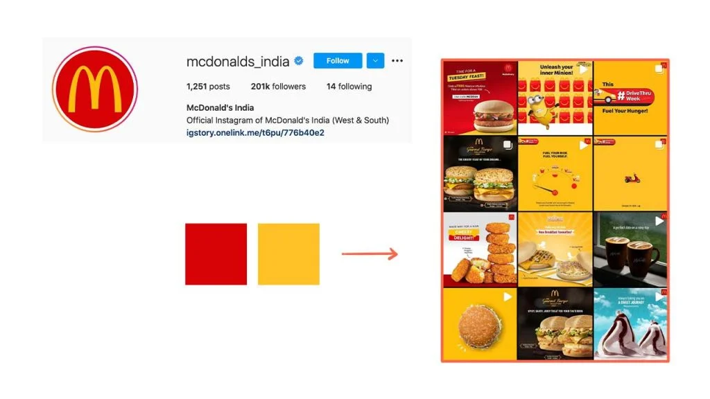
You don’t necessarily force use all the colors from your color palette in your designs just for the sake of visual branding. But you as much as you can, whenever you can, wherever you can. Even McDonald’s has used blue (see above image – bottom right) although it’s not part of their brand identity.
Another good example is Greggs. (Sorry for all the food examples. I love food. Well, who doesn’t)
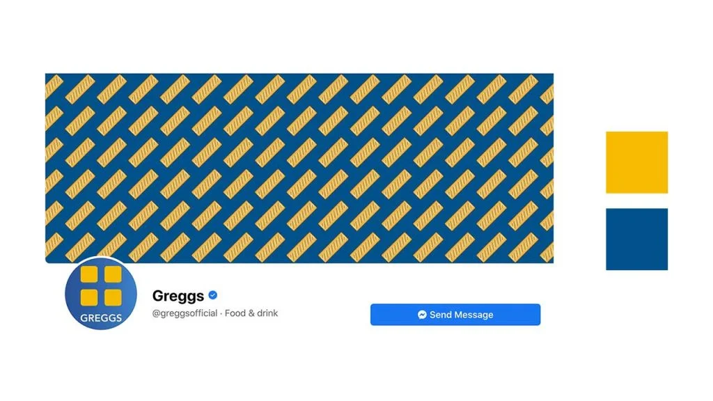
Look at how the profile pic (which is their logo) of their Facebook page complements the Facebook cover. All thanks to the consistent usage of their brand colors.
Using colors is a powerful way to influence people. So flaunt your brand colors as much as you can and where ever you can.
How you write the text on the graphic is very important. Ideally, every brand has certain fonts or font pairs that they use regularly.
For example, Zomato uses Metropolis as their primary typeface and Opensans as their secondary typeface. And the same font consistency reflects in their social media posts.

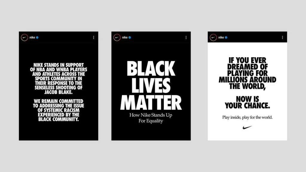
Nike, one of the most famous sportswear companies in the world is well known for posting some motivational content(mostly videos) on their social channels. But when they post visuals, they make sure they use their brand font Futura. To be more precise “Futura Extra Bold Condensed Oblique”.
Tip: If you are struggling to find font pairings or if you are not sure how to choose fonts, you can read the Typography tips article. It can help you avoid any text mistakes that you might be making in your social media designs.
Where do you want to put your logo on social media graphics? What kind of graphics style do you want to follow for your posts? How do you want to use your colors and fonts?
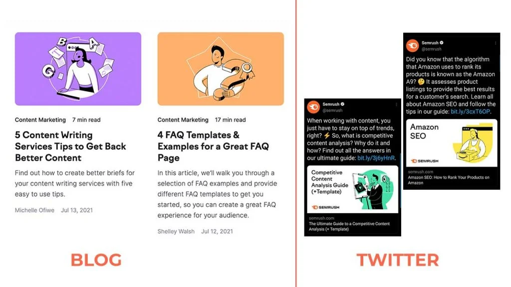
Semrush, a software company uses similar kinds of illustrations in most of the educational content that they share. And they use a variety of colors.
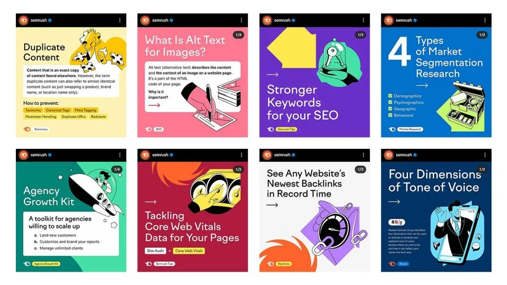
What makes their posts easily recognizable is their usage of eye-popping colors, typography, illustrations style, and logo placement (bottom left). It’s their style.
That’s not it. They follow the same style for their blog content too which reflects the visual style of their Twitter content (as they share their articles on Twitter).
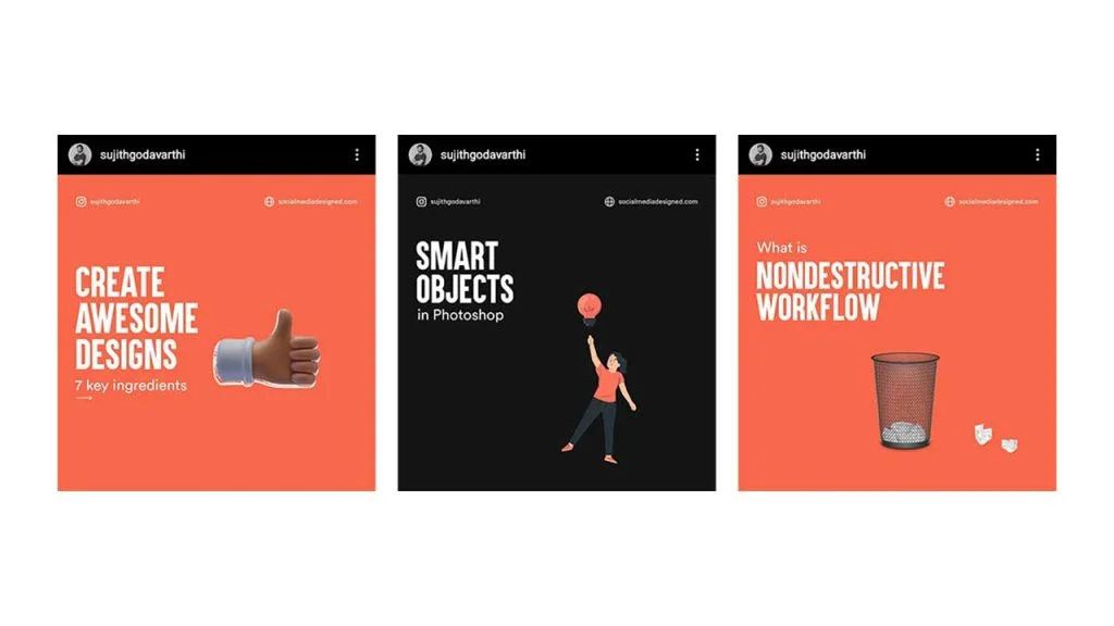
I post content on Instagram based on a style that I’ve defined myself. And that is personal branding details (name & website) on the top, fonts will be Aku & Kamu – Circular Std, Colors will be Orange and Dark Grey, and I prefer to post content in a checkerboard pattern.
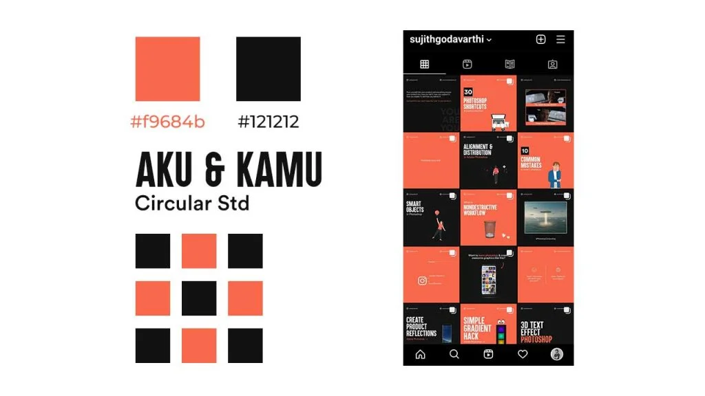
Remember: Content is more important than following a checkboard Instagram grid style.
But if you look deep, you’ll notice that for all my carousel designs, I put the content (text) on the left side in Heading & subheading format, and the visual (Image, Illustration) on the right side.
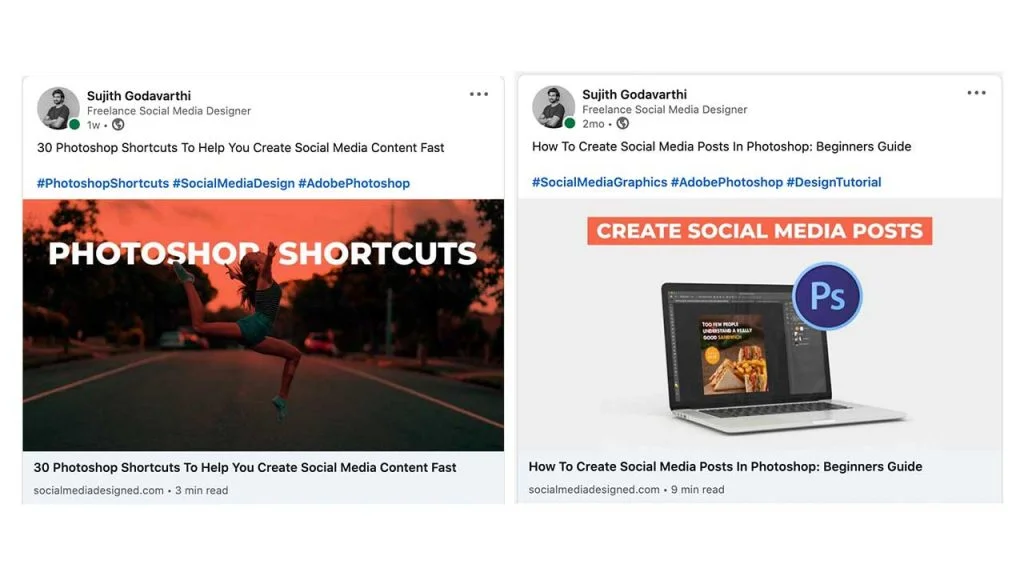
And that’s not it. I try to use orange, black or white colors in my blog images. So when I share them on Linkedin, they somehow relate to my personal brand.
So, define your own style. and be consistent with that. People will notice you eventually.
Will time saving can be the byproduct of creating templates, the main advantage is it’ll help you to be consistent visually. For example, if you share quotes once a week on your Facebook page or create pins to share your cooking articles, you can create a template for that and use it every time.
Doing that will create consistent visual branding.
For example, look at how Durex ran a campaign with #GiftBetterGiftDurex on Instagram by using similar templates.
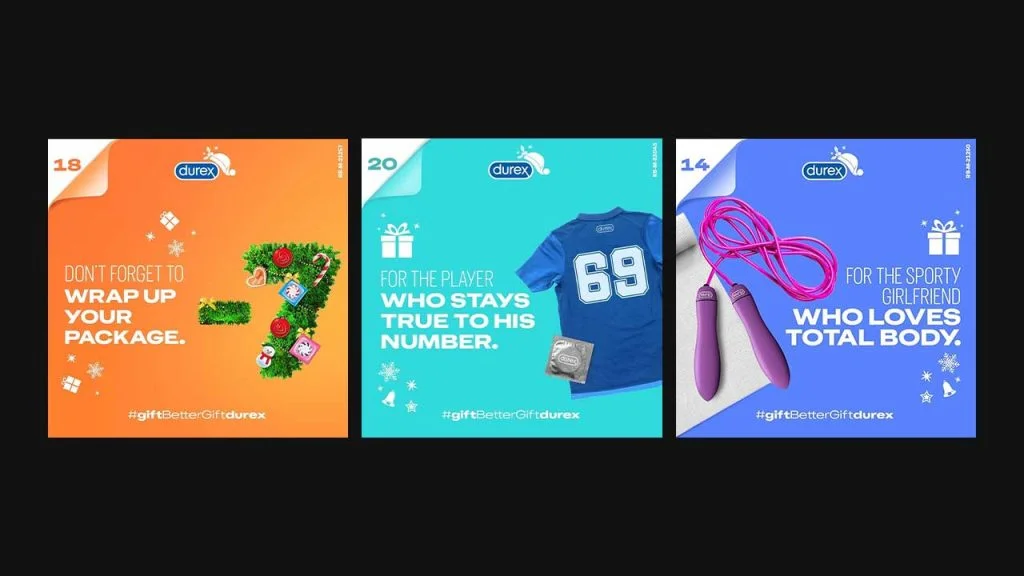
The logo placement, the fonts (a lightweight font paired with a heavyweight one), date placement (top left), and hashtag placement.
They are placed in such a way that if you follow them, and you see these more than 2 times, you’ll remember that this message is from Durex. Don’t you think?
Note: Only the text, colors, and visuals are not constant in each design.
Visuals play a key role in social media marketing. It ain’t 2010. So, make sure you get your visual branding strategy right on social media at the beginning itself.
If you understand these 4 ingredients then I am pretty sure you are gonna rock the visual branding part. Thanks for reading!
3 Comments
15 Best Graphic Design Tips For Creating Social Media VisualsAugust 1, 2021
[…] Related Article: 4 Key Ingredients To Build A Strong Visual Brand On Social Media […]
How To Create Your Own Social Media Templates In PhotoshopAugust 1, 2021
[…] do you know? Using similar templates on social media creates a strong visual brand. So, let’s see how we can create on in Adobe […]
7 Instagram Stories Design Tips To Level Up Visual BrandingAugust 1, 2021
[…] So, how do you make people remember your brand? By visual branding. […]