
The whole point of creating an awesome social media design is to get through the clutter and convey the message to your audience in the easiest possible way.
And without good knowledge of “Typography”, it’s hard to stand out on social media, because it plays a crucial role in making the creative look awesome, attractive, professional, more adjectives, etc.
But what is typography in the first place? Why should we care for it?
It is the art of arranging letters and text in a way that makes the copy legible, clear, and visually appealing to the reader.
Not me, Wikipedia says that.
The simple definition for typography that I can give you is: “appearance of the text“. And it can be seen everywhere.
So, the goal here, in terms of the social media point of view is to make the creative copy look visually appealing and convey the message easily.
The concepts that I’ll be covering in this article include:
I’ve put out 5 important tips to master typography and make your social media designs look awesome. Let’s not waste “the best asset that a human being has ever got” and dive in.
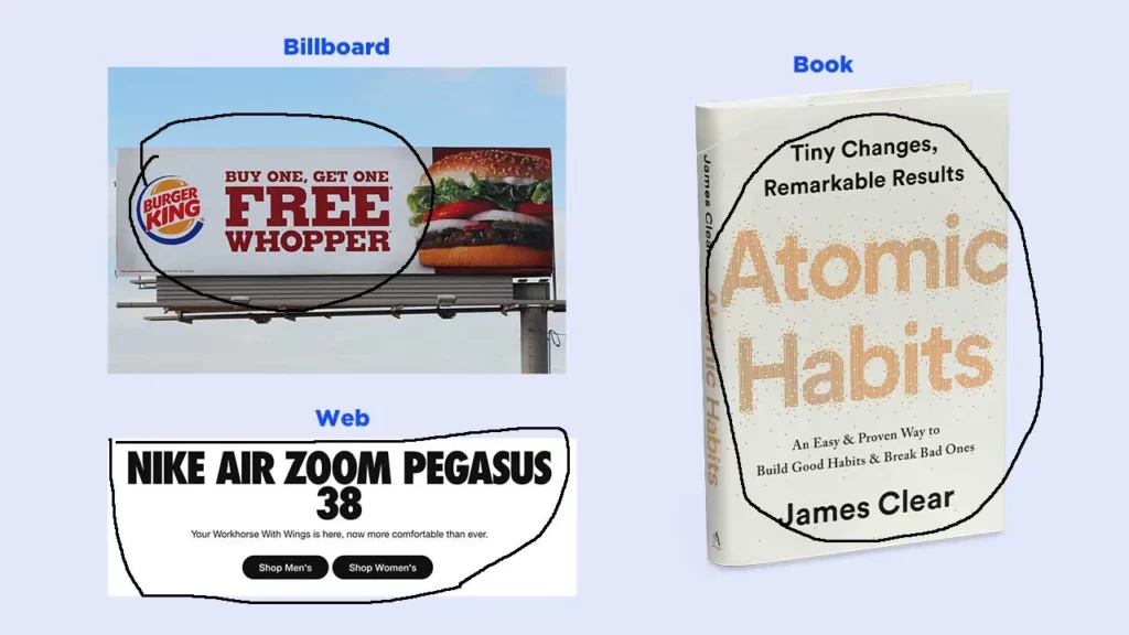
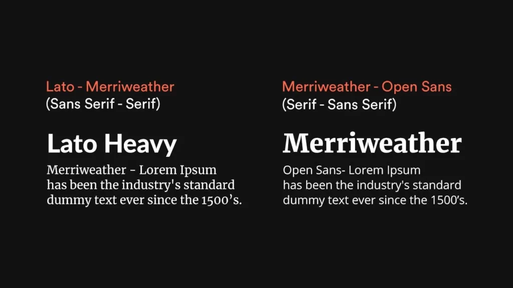
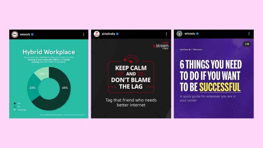
You need to choose a font for your text (creative copy aka the message) in such a way that it reflects your brand identity.
Basically, you need to consider what type of brand you are designing the creative for. Look at the image below and see how the message was delivered in different styles in each case:

But before choosing a font, you need to have a clear understanding of what the basic font categories are and what they represent.
Serif: Safety, History, Tradition, Respect.
Sans Serif: Clean, Clear, Minimal, Friendly.
Script: Feminism, Elegance, Personal, Unique.
Display: Big, bold, and quirky fonts that are mostly used for headings. Best for small amounts of text.
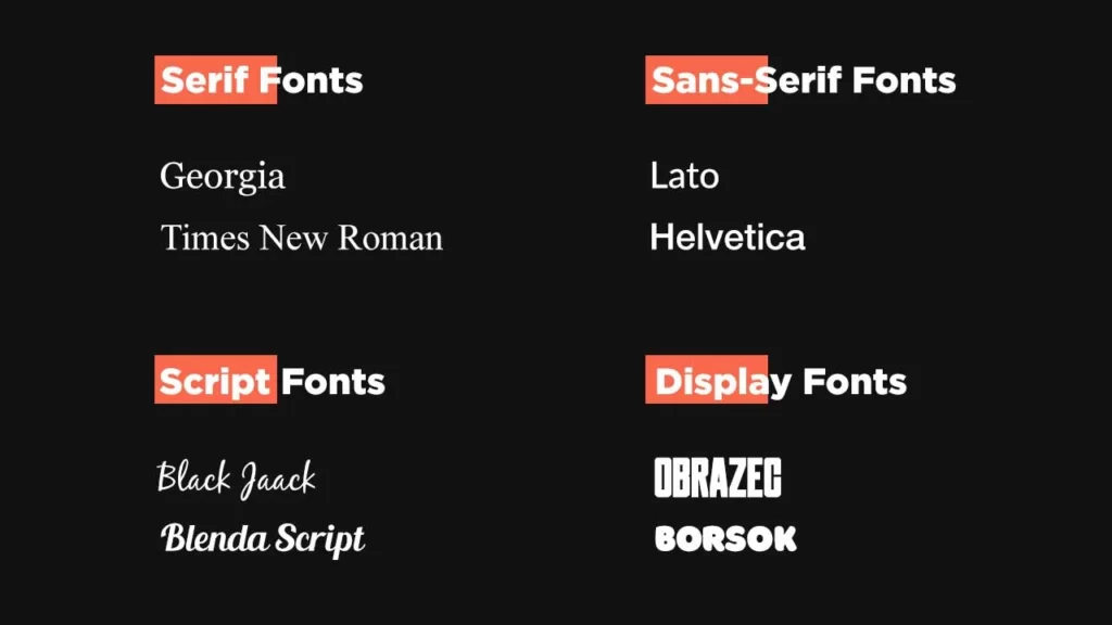
Every font has a personality and a certain message it conveys.
Just consider the purpose of the font in the design.
Is it to show feminism? To attract viewers? Is the font needed for the body text?
Ask yourself these kinds of questions when deciding what font to use.
Think about the way a font appears on the design and if it fits the design style of the whole creative and conveys the message clearly, then that’s the font you are looking for.
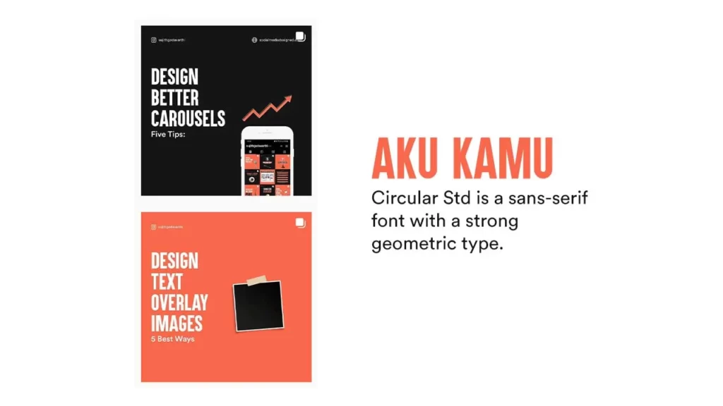
In my case(Personal Branding – Instagram), I use the sans-serif font: Aku & Kamu (for headings – Bold) as the main font.
I pair that with another quality sans-serif font with a strong geometric type “Circular Std” (body text, subtle, minimal) in most of my designs.
But let’s find out some better ways to pair fonts in the next section.
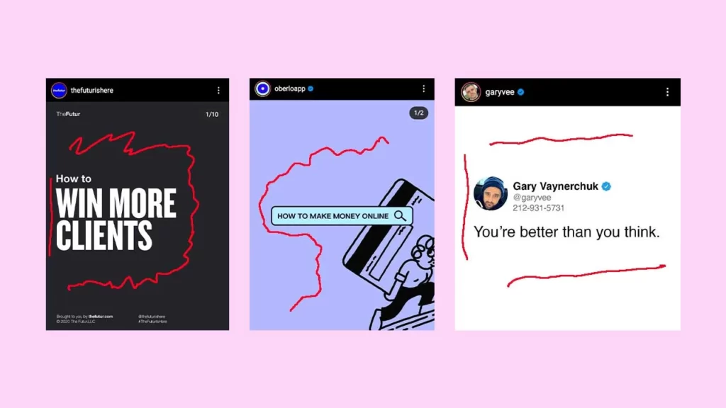
Pairing fonts may feel like a “huh!” thing. But it doesn’t have to be that way. There are some rules that might help you choose the perfect font pairs.
–> Pair a serif and a sans-serif font. Use a serif font for the heading and a sans-serif font for the body content. Or vice versa.
–> Pair a bold font with a lightweight font.
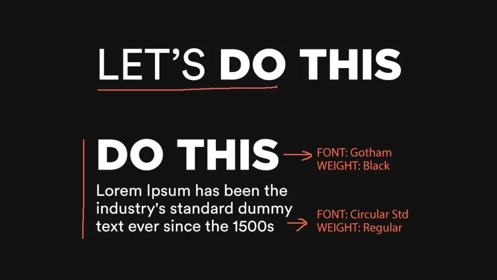
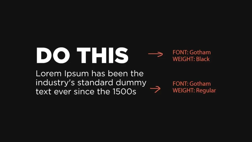
–> If you are struggling to find fonts that complement each other, pair fonts within the same family with different weights.
And skip a weight when choosing fonts from the same family to create a typographical contrast in the design. Gotham Black & Gotham Regular.
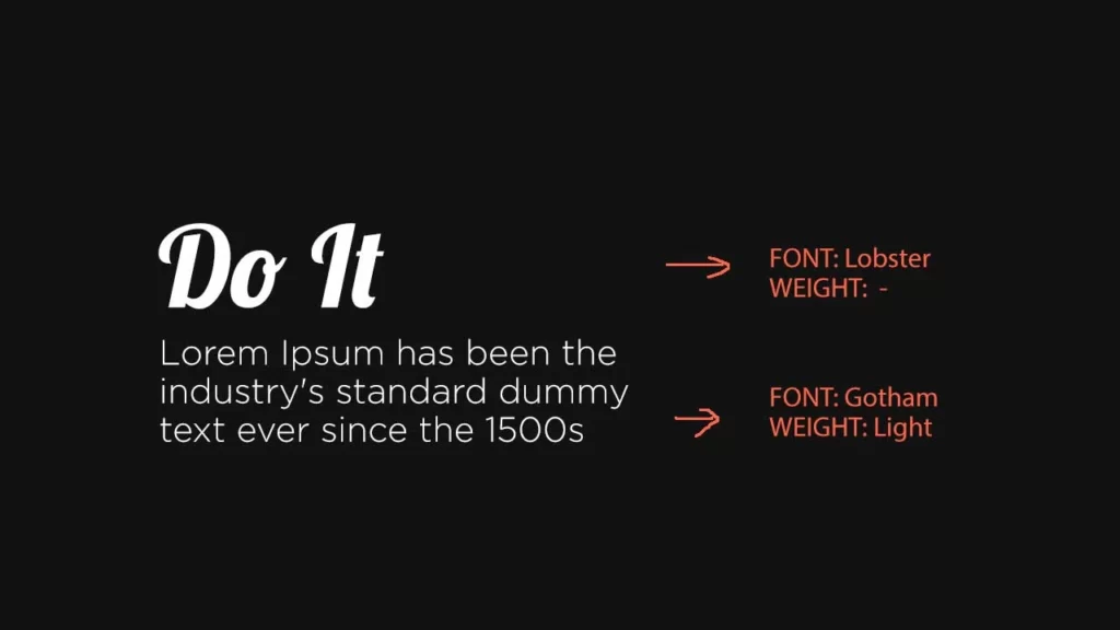
–> Pair a decorative font with a simple font. In the image below, I paired Lobster(script font) with Gotham Light.
Basically, the simple formula here is opposites work well in font pairing. Simple with bold, serif with sans serif, etc.
One more question you might get is how my fonts you should use in a social media creative.
The correct answer is: to limit the font usage to 2.
If you want to or need to use more than that, use a different style (Italic), size (text size), and weights(regular, medium) of the same fonts.
And how do you use these variations? We are gonna talk about them in the 5th point.
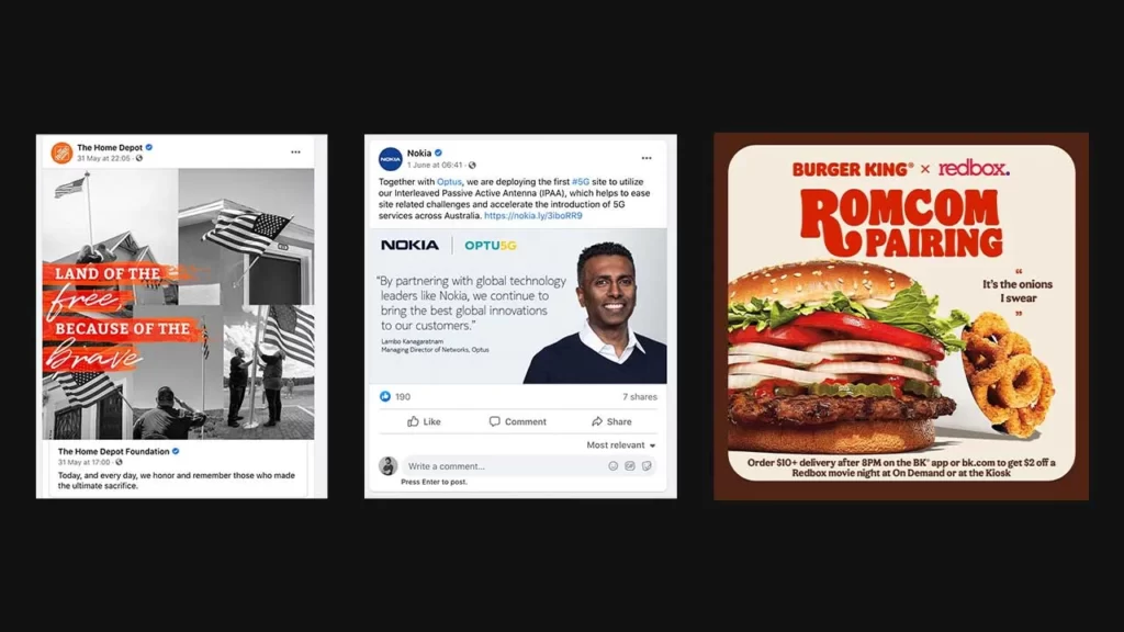
Here are some Instagram post designs with good font pairings.
Tweak the values of the leading and tracking until you get a visually pleasing result. But, before that let’s see what these terms mean and how they affect the designs.
Leading refers to the vertical space between lines and Tracking refers to the uniform space between all letters.
All you have to do is tweak the numbers (as shown in the image above) till you get the end result that looks visually appealing.
You can adjust these numbers in the character panel in Photoshop. If you don’t see the panel in the sidebar, go to Window (top menu) and click on “Character”.
And this is how you can apply these typography concepts in your social media designs:
There is another term called Kerning which refers to the space between individual letters.
But this option didn’t help me much in terms of putting text on social media posts. If you want to know more about Kerning, you can refer to this article.
Ok, let’s start with negative space. It’s the part or area of a creative where you see nothing but a color. The whole point of using negative space is to drive the viewer’s focus to the positive space where we will be placing the main text/image to drive focus to it.
Important Tip: Don’t place any design elements along with the corners of the canvas and always align all the elements to one axis (or one side).
To explain the concept of alignment and distribution in a social media post, have a look at this one:

Look at how the text is aligned to the left perfectly (From the heading – “Unified Identity” to the text below the images, every piece of written content is aligned to the left side). All the text elements are distributed equally, which gives a professional look to the design. Maybe that’s the reason why I’ve found this one on Linkedin.
Important Tip: When in doubt, align the text to the left side, leaving some space. People read from left to right, top to bottom.
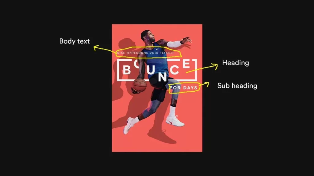
Hierarchy is the arrangement of text in a design based on the importance of what the viewers should see first. In general, any design has 3 levels of textual hierarchy. A heading, subheading, and body text.
The number ‘3’ is not a rule. There can only be 2 (minimal designs – Heading, Body Text) or more than 3 in social media designs. It depends.
But the whole point of creating the hierarchy is to direct the viewers to what we want them to read first. We write an effective copy on the creative to grab attention.
But what if the viewer didn’t even notice that in the first place? So, we create a hierarchy to make the viewers notice what we want them to notice first. So, in that way, you can control what they will read first.
Ok, but how can I make the creative copy and all the other text on the creative stand out? Let’s talk about contrast then.
The whole point of creating contrast in designs is to show a big difference between the elements which in turn creates visual interest. Why do we use white text on a black background or vice versa? To create contrast, right? To make the white pop well on a black background.
And typographical contrast can be achieved by varying size, shape(or style), weight, color, and, spacing.
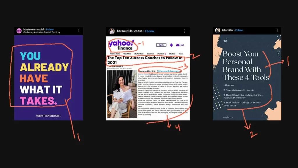
There is no rule that you should be using only one of them or all of them at a time. It depends on how much text you are putting in the design. Have a look at this example:
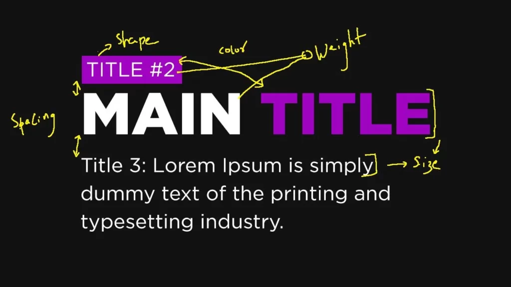
Points to notice in the above image:
And here are some social media designs that have good typographical contrasts:

It’s a bit hard to master Typography. But I think I’ve put out enough tips and methods that if you follow them, you can make your designs breathe and look amazing.
Let me know in the comments if you’ve got any typography tips, that I’ve missed out on.


12 Comments
10 Mistakes To Avoid In Photoshop While Designing Social Media ContentJune 4, 2021
[…] things like alignment, distribution, typography, whitespace, etc. Make sure you follow these design tips to make your social media designs look […]
4 Key Ingredients To Build A Strong Visual Brand On Social MediaJune 4, 2021
[…] are struggling to find font pairings or if you are not sure how to choose fonts, you can read the Typography tips article. It can help you avoid any text mistakes that you might be making in your social media […]
15 Best Graphic Design Tips For Creating Social Media VisualsJune 4, 2021
[…] know it seems like a lot. But it’s not. I’d recommend you to read this article where I’ve talked about the typography tips you need to know to master putting text on social […]
21 Best Font Pairings For Your Social Media Designs & GraphicsJune 4, 2021
[…] I want you to know some things about pairing fonts (I’ve already talked about this in the typography article. You can check that for some in-depth typography concepts and […]
15 Best (FREE) Fonts For Headings In Social Media PostsJune 4, 2021
[…] to make sure you keep the weights of the fonts used in the body text pretty low (skip a weight) to achieve a typographical contrast in your […]
5 Tips To Come Up With Creative Designs For Your Social MediaJune 4, 2021
[…] I learned more about typography, I became better at putting text on social media posts in such a way that the design looks much […]
Brij BhushanJune 4, 2021
Thank you for sharing this valuable content, it is very informative and informal. I hope you keep updating us.
Marc JacobJune 4, 2021
It is an Informative article and a lot of thanks for sharing your precious knowledge with us. It increases my knowledge and improves my weakness in typography use on social media graphics.
Sujith GodavarthiJune 4, 2021
I’m glad that you liked it. Thanks!!
9 Design Tips for Creating Stunning Social Media GraphicsJune 4, 2021
[…] Source […]
5 Common Design Mistakes To Avoid On Social MediaJune 4, 2021
[…] Also Read: 5 Powerful Typography Tips To Craft Beautiful Social Media Graphics […]
9 tips voor het maken van afbeeldingen voor sociale netwerken - Tehnografi.com - Technologie Nieuws, Recensies en TipsJune 4, 2021
[…] Bron […]