
Marketing is a contest for people’s attention. Not me, Seth Godin said this and it’s 200% true. With more are more businesses joining social media it’s never been so hard to get traction on social media.
We live in a visual world. Science says that humans respond to visual data better than any other type of data and 90% of information transmitted to the brain is visual. Ok, wait! Why are you saying this?
Just to point out that it’s very hard to get traction on social media without an eye-catching design!
We now have an ocean of ads & too much promotional content on social media and the only way to make the users stop scrolling is by a pattern interruption. It can be done with a better copy, creativity, and better graphics.
While I’ve already talked about how to design social media posts via the 6 step framework here, I thought that it’s time to talk about a framework to make those graphics better. So, I’ve got 8 powerful design tips for you to make your images & graphics grab more eyeballs on social media. If you are a business owner or marketer or designer then these tips will definitely help you a lot.
The topics I’m gonna cover in this article include:
While square-size posts can fit “Ok” on any social platform, it’s always recommended to resize the content for the particular social platforms that you are looking to build a social media presence, before posting.
For example, you can post 1080px*1080px size posts (Instagram post size) on Pinterest, but portrait size always works better than the square ones on Pinterest. A simple google search will tell you what size you need to use before designing for that particular social platform.
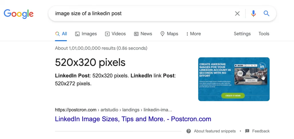
And here is a social media size guide from Hubspot where you can even find the resolutions you need to use for profile pics, cover photos, pins, posts, etc.
Let’s start with stock photography. Extensive use of stock photography might (or will) dehumanize your brand. But there is a right and wrong way to use them. If you are placing the design elements in the right way people won’t care much about the stock photo.
In the above post, although the saloon business used a stock image, the thing that mattered much is the design and content (Inviting customers & 20% Off), and the stock image(beauty and makeup related) only added more context to the content. So that’s a good way to leverage stock photos. Now look at this one:
This is just obvious that they have used a stock image and placed text on it (which is not visible clearly). This kind of post will definitely not stop the scroll in the feed.
Important: If you are using a stock image, the image shouldn’t be the main focus in the post.
Stock photos will save a lot of time and money. But, you know what? If you can use real images that would be way better.
People who are following your business on social media would love to see and know more about your business. And you don’t need to hire a photographer (well, hire one if you can) to take your own business and product images.
Just use your smartphone and take some nice snaps of products, people, customers, etc. For social media, original images will work way better than any other stock photo on the internet, especially if it’s an eCommerce or any other physical product-related business.
Colors and texts play a big role in how well your content is presented to your audience. That’s the reason why it’s very much necessary to experiment with fonts and colors in the beginning, till you develop a perfect aesthetic for your brand.
Never use more than two different fonts in a design. Try using the same font with different weights (regular, medium, bold, italic, etc) if you can. And for colors, try using your brand colors wherever and whenever you can
You need to make sure that all the content pieces that you post on a particular social media need to have something in common that makes you stand out. And also you need to ensure all your social profiles have a “common thing” that people will recognize as your brand. To achieve this, you need to ensure you are using the same color palettes, typeface, and logo avatars.
I like the way how this restaurant business in Bali is consistent with its colors and typography.
Every image that they post also has a greenish filter. Although many big brands and businesses don’t necessarily follow this, it’s still a best practice to gain traction in the long term. If done perfectly, people will recognize your brand without looking at the logo and your profile handle.
Almost everything that we post on social media will have some sort of text. Whether it’s an offer post or announcement post or any other kind of content type, it doesn’t matter. It’ll have text. And here are 5 design tips for perfectly overlay text on images.
#1 Add a color overlay on the image and then add text. So, it should look like: Text > Color Overlay > Image in terms of the layer stack(Oh yeah, I am a photoshop guy).
#2 Blur the image and then add text.
#3 Add visual assets (colored rectangles, other shapes; borders) behind and around the text.
#4 Add a shadow to the text. This makes the text feel as if it is popping out. This is the reason why “To all out Road-Queens”, is still readable despite huge brightness(because of the sun in the image).
#5 Add visual assets (colored rectangles, other shapes; borders) behind and around the image in the post so that you’ll have enough space to write text.
For an in-depth explanation of these 5 tips, go here.
Basically, the goal is to make the text stand out. Especially the headline should pop up. So in that way, if a user is interested in the headline (50% off on electronics, 5 tips to lose weight), then he/she will be more likely to spend time on your content.
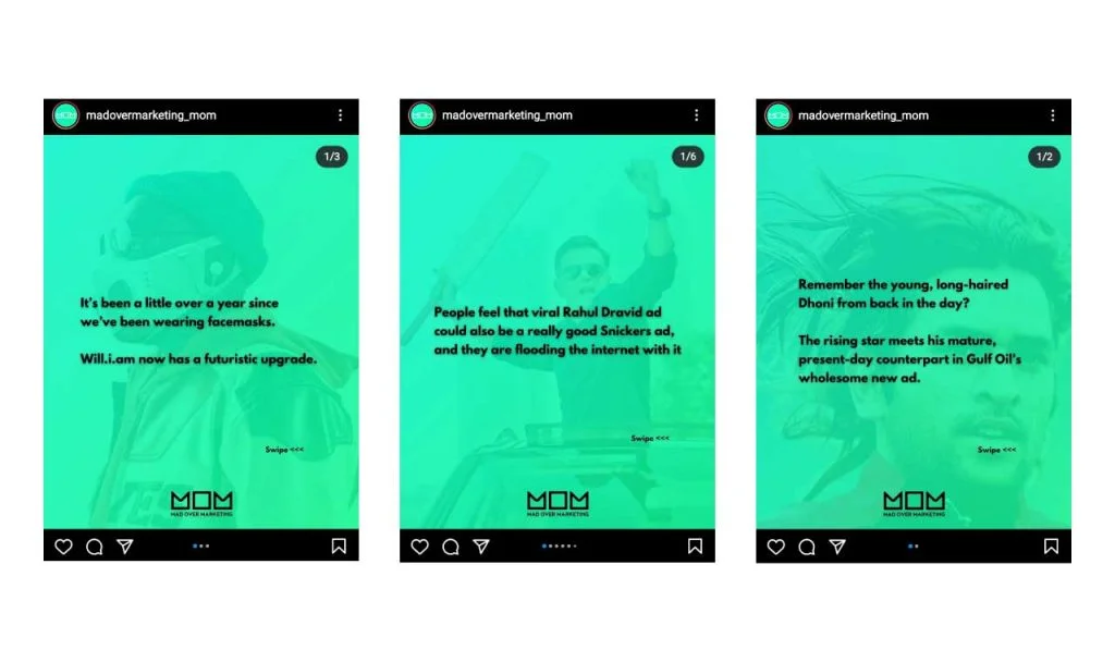
Templates are true time savers. I’m talking about saving tons of time in designing social media content.
Create templates for the content type that you post regularly. Mad Over Marketing posts something similar(in terms of design) quite often. I’m pretty sure they don’t design this every time from the scratch. And just imagine how much time they would have saved till now by designing the content every time from a template.
If you can keep some design elements common and change some design elements then that would bring a lot of variety to the table. That’s what Preview App is very good at.

They keep the fonts and some visual elements common but change the colors, text (obvious! they can’t post the same content every time), emoji icons, etc.
Final Tip: Create templates for content types that you post on your social media regularly: Testimonials, announcements, etc.
Our brain only needs 1/10 of a second to understand an image. and that’s not the same with textual content. That’s one of the main reasons why content marketing is getting more and more visual. So, simply what I am saying is don’t put too many words. Even if you put it, make it interesting.
In the example below, the “increase” in % is replaced by an upward arrow.
Some tips:
Pinterest is full of amazing graphics like these and can be a good source of inspiration for you if you are looking for ways to replace words with visuals.
When the design elements are aligned perfectly and distributed equally, the creative will look professional. Look at this post by Neustar Inc.
The photos are distributed equally in the creative and the text is aligned to left perfectly (From heading – “Unified Identity” to the text below the images, every piece of written content is aligned to the left side).
And as you might have noticed in the above creative, there is a lot of empty space (plain black) on the right side. That’s called White Space. So white space(also called Negative Space) is the area of the creative that isn’t filled with any design elements like text, images, shapes, etc. It’s the area that won’t attract the attention of the user. Keep these principles in mind every time you are creating a new post.
“Simplicity boils down to two steps: Identify the essential. Eliminate the rest.”
– Leo Babauta
Don’t overload the posts with too many graphical elements and more text. It’s ok to decorate your content with shapes, borders, patterns, etc but don’t do anything too crazy!
Remember that the goal is always to convey the message in the easiest possible way. So despite your creative freedom, always focus on creating clean designs.
There are a lot of terms I could’ve used like Kerning, Asymmetrical Balance, Organic Shapes, Proximity, etc in this article to explain the design process. But I didn’t (well, technically I did use those terms now, but you know what I mean). I didn’t use them because I don’t want to overcomplicate things. I just gave you some basic but very powerful tips.
And I just want you to do the same. Don’t add too many design elements just for the sake of adding. Just because you are a designer doesn’t mean you have to do all those stuff. And a good design is not one that is filled with more stuff.
Just focus on creating the design that’ll be easier for your audience to grasp.
The content has to be more than attractive. It should provide value in some form(educate, entertain, inspire). If you can create helpful content (CONTENT IS THE KING) and can present it in an attractive way (DESIGN MATTERS TOO) to your audience then you’ve won the social media game.
If you have any graphic design tips for social media, please mention them in the comments! That would help me and my blog visitors, too. Thanks for reading!
10 Comments
How To Promote Your Youtube Channel On Instagram: Ultimate GuideMay 1, 2021
[…] and text that you put on your content. This is the reason why thumbnail design on Youtube and content design on Instagram should be somewhat similar and complement each […]
How To Create Social Media Posts In Photoshop: Beginners GuideMay 1, 2021
[…] as a good design or bad design. “Good Design is subjective”. So our goal should be to create something eye-catching so that it can stop the users from scrolling their […]
How To Resize Social Media Graphics & Images In Adobe PhotoshopMay 1, 2021
[…] Considering the huge amount of competition for attention on these social platforms you need to create some eye-catching designs to see some kind of […]
Should I Use (Learn) Canva Or Photoshop To Design Social Media PostsMay 1, 2021
[…] You need creativity and practice to create an eye-catching social media post. […]
5 Powerful Typography Tips To Craft Beautiful Social Media GraphicsMay 1, 2021
[…] I’ve put out 5 important tips to master typography and make your social media designs look awesome. Let’s not waste “the best asset that a human being has ever got” and dive […]
10 Mistakes To Avoid In Photoshop While Designing Social Media ContentMay 1, 2021
[…] things like alignment, distribution, typography, whitespace, etc. Make sure you follow these design tips to make your social media designs look […]
A Beginners Guide To Adobe Photoshop For Social Media DesigningMay 1, 2021
[…] Related: 8 Powerful Designs Tips To Create Eye-Catching Visuals For Social Media […]
What Is Social Media Design And How Important It Is In Marketing StrategyMay 1, 2021
[…] create, it’s time to make your social media more visual. For that I’d recommend reading this article where I’ve talked about some really important design tips that can help you craft beautiful […]
10 Social Media Content Creation Tools & Resources I Use RegularlyMay 1, 2021
[…] But that same can’t be done in Real Estate or maybe when you are trying to build a personal brand. Or at least I think you shouldn’t use them that often. To use them or not, depends on you and the niche you are working on. After all, your goal is to make the designs look better. […]
4 Key Ingredients To Build A Strong Visual Brand On Social MediaMay 1, 2021
[…] How? By implementing a strong “Visual Branding Strategy”. This strategy is all about creating good visuals and at the same time branding those visuals (with visual cues) so that people can remember your […]