Writing effective headings for your social media posts is very crucial and can be called a “scroll stopping factor”.
Because unless the headline gives a hint of what we can expect or something we are looking for, we won’t stop.
Social media is a war zone where people and brands fight for attention. A bit harsh, but true.
So, writing a headline that grabs attention, can make the scroll stop? Probably, yes. But along with the strong line, the presentation of that line in the social media post matters too.
The headline is the ticket on the meat. Use it to flag down readers who are prospects for the kind of product you are advertising.
– David Ogilvy
Ok, so how do I make my social media headlines look better? Or awesome? or hot?
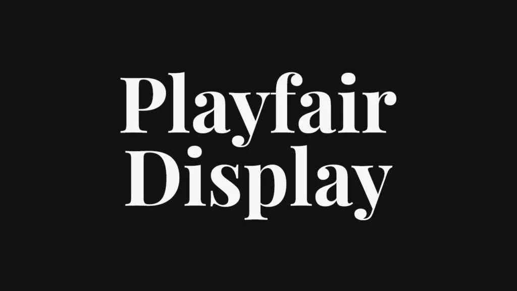
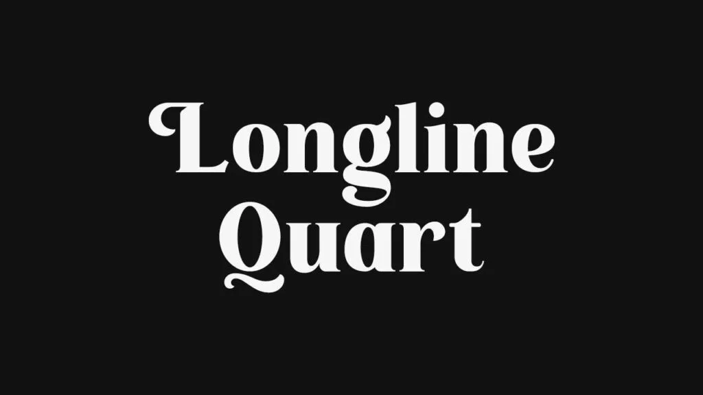
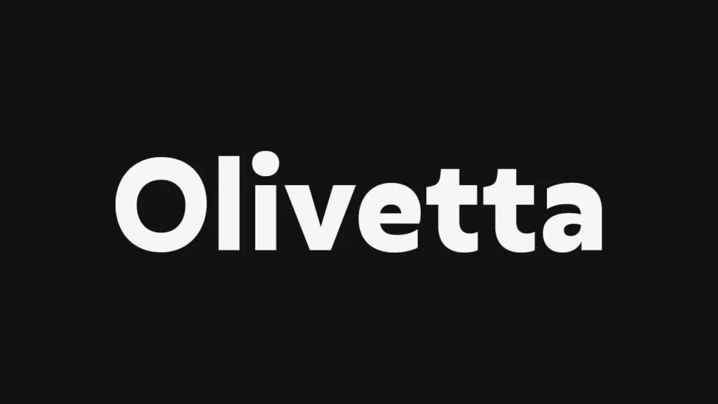
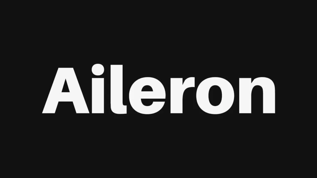
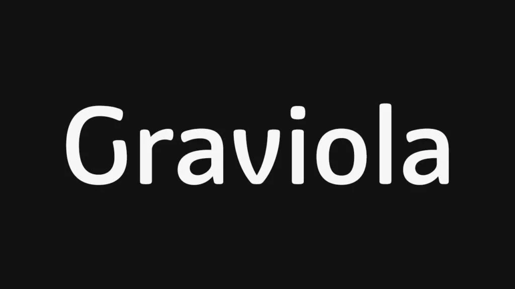
Well, use display fonts (Display Fonts are fonts that are known for being used at large sizes – headings. Simple they are used in headings because they are known for their strong personalities & attention-grabbing characteristics) Or fonts that look bold (so be can sans serif or serif fonts).
One thing to remember when using these bold fonts is to make sure you keep the weights of the fonts used in the body text pretty low (skip a weight) to achieve a typographical contrast in your design.
Related Article: 21 Best Font Pairings For Your Social Media Designs & Graphics
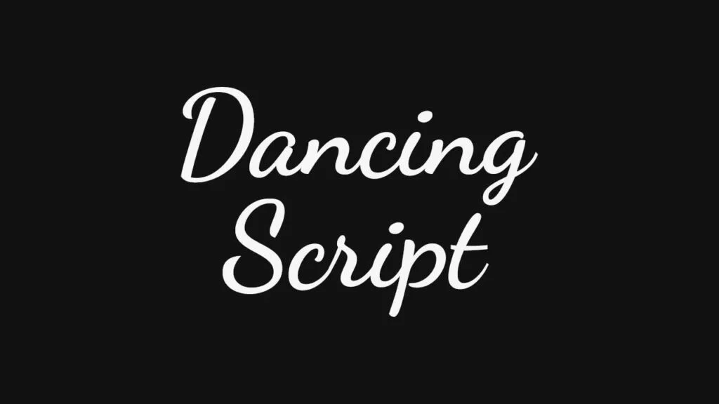
Now, let’s have a look at some of the best (and most important: FREE) fonts that you can use in your social media graphics:


