
Guess how many Instagram accounts are using the ‘Story’ feature. 10M? 30M?
It’s 500M as of 2019. So, probably more accounts are using it by now.
Of course, you might be one of them.
But how effectively are you using this feature?
Are you tired of your Instagram stories looking almost the same every time you share something?
Are your visuals up to the mark?
Well, I’ve got 7 design tips for you that I am pretty sure can help you create better Instagram stories.
But before you think of “Why put so much effort into designing & crafting stories that just disappear in 24 hrs?”, let me tell you this:
As of 2019, 36.6% of people watch Insta Stories. While 63.4% watch Instagram posts. (Source: The Preview App). 36% is still a lot!
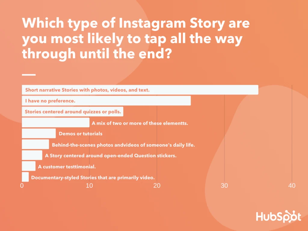
And if you are wondering which stories people are interested to watch, here is what Hubspot found out:
Now that you know what people want to see and how important it is to leverage Instagram stories, let’s see how we can make them visually appealing.
Of course, you know that the resolution you need to consider for designing an Instagram story is 1080*1920.
But taking only that into account is not enough. You need to make sure that the content lies within the lines. Lines, that you need to set to avoid the content colliding with Instagram’s UI.
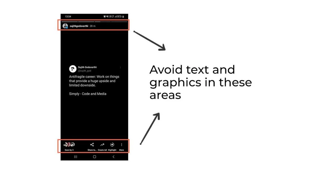
Other than color or a background pattern, make sure you don’t place any design elements there (Instagram recommends keeping all key design elements between the center 1080 x 1420 pixels).
Have you ever heard of ‘the marketing rule of 7‘?
The rule states: “A prospective buyer should hear or see the marketing message at least seven times before they buy it from you.”
So, how do you make people remember your brand? By visual branding.
It’s not necessary that stories should look way too professional as they are gonna disappear in the 24 hours anyway.
But using your own brand colors or fonts most of the time will make them remember your brand. Using similar design elements is also one of the best ways to achieve consistency in the design.
RCB (My favourite IPL team!) added photos to their stories, but in their own visual style.
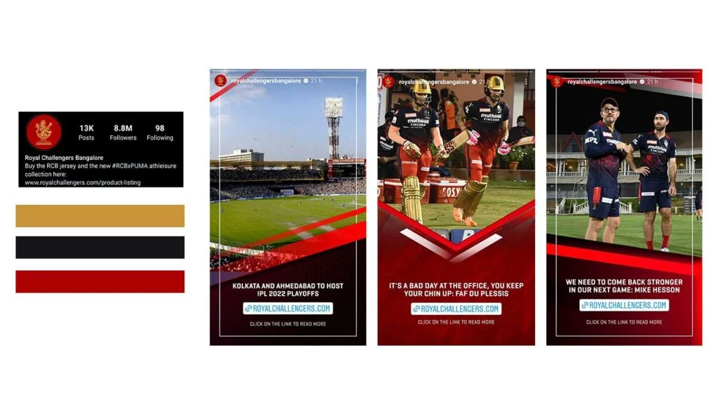
Look at how the colors, fonts, and design elements like borders and shapes were used repeatedly in their designs but in a different manner.
Doing that will help you build better brand recognition. Your followers won’t check your username anymore once they get used to your design styles.
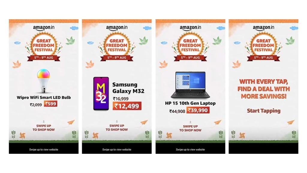
Look at how Amazon India created a template for the “Great Freedom Festival” and used it over and over in their stories.
I know I am highlighting the importance of visual branding again, but the point is if you are consistent even for a smaller amount of time, your audience will remember your brand.
Use similar templates for all the events you are promoting.
Create similar topics for particular content types. For example, you can create a template for ‘sales’ stories and use it for all sales-related stories.
You can do the same for quotes, products, behind the scenes, etc.
Post similar things (in terms of design) and make them remember your brand. You can use a specific set of colors when creating content around the same topic.
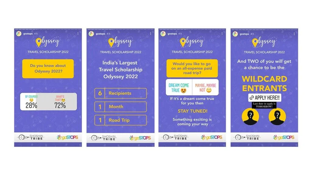
Gostops did it in an excellent way!
Time for another stat: Nearly 58% of people have become more interested in a brand/product they saw on stories. (Source: Hootsuite)
Ok, we know how to use templates. We talked about visual branding.
But when we share something, the goal is not only to get that recognition from people so people know that it’s our story but also to grab their attention and make them spend their time reading whatever we are sharing.
And that is the reason why writing the text, adding the color, and placing it in the right position is so important.
Our goal should be to make it easy for people to consume content.
Remember that stories move fast and we want our audience to read the content effortlessly.
The simple & clearer the text, the better it is for people to read that. Some things to keep in mind to achieve that:
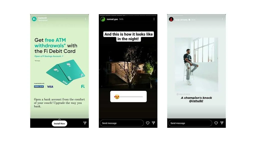
You don’t want to make your Instagram stories look boring, right? So, why not try other stuff like filters, emojis, polls, Q&As, patterns, layouts, GIFs, stickers, etc.
Do brands and businesses use all of this stuff, anyway? Of course, they do.
Some ideas you can try can be:
Most importantly, you can implement all of these from the Instagram app itself without using any design tool.
Sometimes we don’t just want people to read the stuff and move on. We need them to take action.
So why not make the process of them taking action easier?
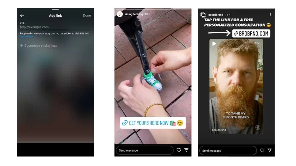
What I mean is instead of asking people to tap on your profile and click on the link in the bio, why not just use the “Link” feature or “Swipe Up” feature (if you have more than 10k followers).
And how about designing it beautifully and putting it in a place where it’s easily viewable? Yes, we’ll at least have more chances of people clicking on it, and of course, isn’t that our goal?
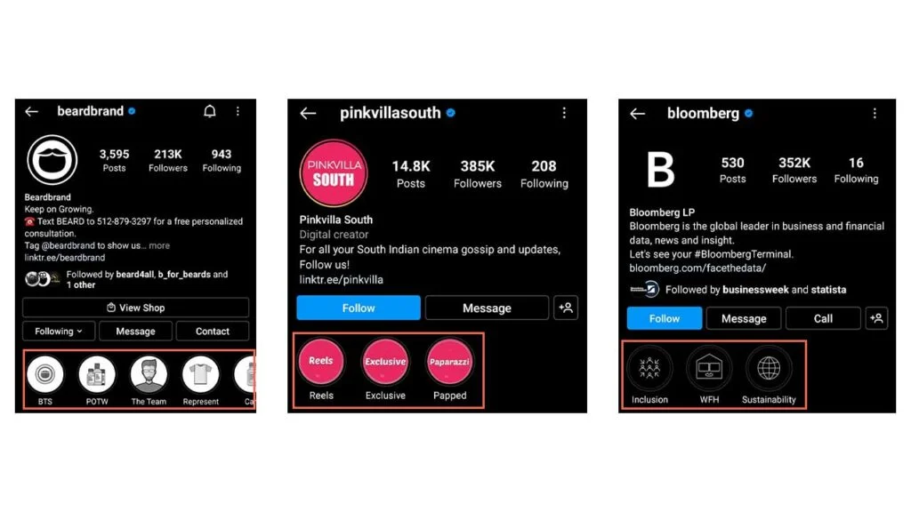
Yes, stories disappear after 24 hrs. But not if you add them to the highlights section.
The highlights section gives us a better opportunity to arrange all of the old stories (memories).
It appears below the profile and appealing highlight covers can help you make a great first impression.
So, instead of just keeping the default covers, you can add your own custom covers that match the brands.
A colored background (brand color) with an icon related to that particular set of stories (similar category) is one of the famous styles out there. And moreover, gives a clean look to your profile, like this:
You should try it.
Ok, before you leave this page, I want to give you some non-design tips that can impact your story’s reach.
Visually attractive content has a lot of demand in the social media space. Making your Instagram stories look good is one of the few things that you can do to build a strong brand.
‘Good design’ always accounts for ‘Good business’.