
Designing for social media isn’t easy. But it’s not that hard too! At least it won’t be after you complete reading this article.
But why put so much effort into design? Why design is so crucial for an effective social media strategy?
You need a design to make your content stand out from the crowd & competition and to convey the message visually to your audience in the easiest possible way. Nobody wants to read the text and it isn’t effective anymore on social media.
From attracting to nurturing your audience to making them buy your product/services, design plays a key role in social media marketing.
Social media is the place where real interactions with your prospects and customers take place. It’s called social media for a reason. So putting time and effort into designing content makes sense, right?
Designing for social media is not the same as designing a website. A social media design need to tell a story and it’s the designer’s job to design in such a way that the visual puts the required message in the viewer’s mind in the shortest time possible considering the decline in the average attention span of a human.
Like this one:
It gives the message of “what the product is about and how much discount they are offering” very clearly and quickly to the viewers.
If it’s not for the visual, people (their audience) won’t even know that the company is offering them something. Oh! Don’t think people will read text content. The attention span of a human is now shorter than a goldfish.
We are not human beings anymore (Don’t judge me. Read the next sentence). We are visual beings. We process visual content faster than any other content type.
No matter how many content ideas you have for your business or personal branding to put on social media, the content has to be designed well to get through the clutter and reach your target audience.
Now that you are convinced that “Social Media Design Matters” let’s move on.
I prefer Photoshop and Illustrator for all the designs I create. Although both these Adobe tools aren’t free, the freedom it gives you and the features these tools have are amazing (Adobe didn’t pay me for saying this).
And there are tons of free and paid tools that you can use to design social media posts and here are some:
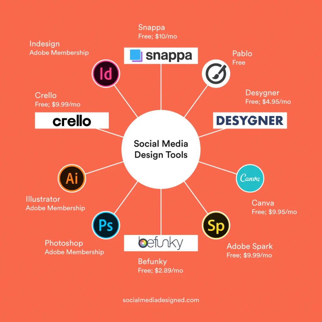
Caution: This article is written based on the process I follow with Photoshop (or illustrator) software. So the design workflow might be different but the steps described in this article can be applied with any other design tool.
Now time for the big thing! In this article, you’ll learn how to design social media posts via the 6 step process I follow while designing social media graphics for businesses. I am a freelance designer so I think you can trust me on this.
In general, what I believe is that almost every social media post consists of these 5 elements: Background, Visual Content (Images, Illustrations, etc), Text, Visual Assets (assets that make the post look more attractive), and Branding elements (logo, colors).
Look at this post that I have designed for a restaurant and you’ll have a good idea of these 5 things:
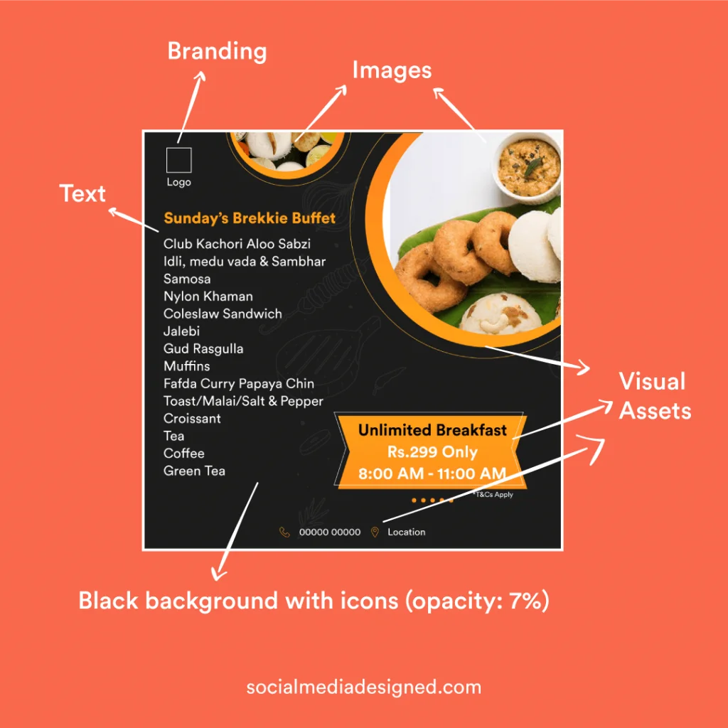
The whole visual (which is a menu) contains 2 images, text (menu items, restaurant details), Background (black with food icons: low opacity), Visual assets (Text boxes, icons, circular masks in which food images are placed), and branding (logo, colors: black and yellow).
There is no guarantee that every post should contain all these 5 elements. This post by Nike has only 2 elements (Text and background):
So, using only the necessary elements is important than stuffing the post with all the elements.
Time to go deep now!
When designing for social media, the first thing that should come to you in your mind is “Why and What”. Why am I designing this (the purpose)? What message do I want to convey to my audience?
Am I trying to bring visitors to my website? – The Why.
Is it to tell them about a new offer? – The What.
And once you know the goal, just think: “How can I design it so that the message will be conveyed in the easiest possible way and at the same time make it should look attractive and professional.”
For example, the purpose (the ‘why’) of designing this carousel for my Instagram is to educate my audience. The title, and the way it’s written, and the illustration tell (‘what’ message) that this content piece is about the difference between Boosted ads and Facebook ads.
You don’t need to put a lot of effort into thinking and visualizing a design and can follow the 40-60 rule that I follow while designing for social media.
You can create a new and attractive design by taking inspiration from an already designed visual and adding your own creativity to it.
40% Inspiration + 60% Creativity = New & Attractive Design
So it’s very important to get inspired before you start designing and these are some references where you can draw some inspiration.
See what kind of design idea resonates with the content that you have in your mind and make sure you import/write the text in the photoshop document or whatever software/tool you are using at the beginning itself so that you’ll be bombarded with ideas to fit the content well in the design.
Must follow: Make sure you follow the perfect canvas size based on the social platform you are designing for. You can find the right sizes for social media posts here.
A background design is all about playing with colors and patterns. Make sure you choose the colors wisely if you are not going with brand colors. The color you choose for your background sets the mood for the whole visual that you make.
Just don’t use any crazy color combinations that’ll make users uncomfortable in viewing the information.
Go with brand colors (If you have any) for all of the posts. You can vary the tone, tint, and shade of the colors to avoid a boring look. You can use this tool to find out the right tint/shade of any color.
Recommended article: 28 Color Combinations That Work Like Magic in Social Media
You can also use sites like Freepik, Vector4free, Vecteezy, or any other free vector websites to find a background by using relevant keywords.
Edit the downloaded background and put it in your design if it makes sense and remembers that at the same time it should look good also.
But how to use downloaded files and extract the layers that we need so that we can use them in our design? Don’t worry, more about that in step 5.
The background doesn’t need to be a solid color or gradient or vector patterns, etc. It can be an image also like this:
It all depends on your needs and what resources you have.
Text is just letters and words that you right and typography isn’t the same as text.
“Typography is the art of arranging letters and text in a way that makes the copy legible, clear, and visually appealing to the reader”. This is the definition I found on the internet.
The whole point of a design is to convey the message and the reason why this step is so important and you can’t afford to fail. Make sure you choose the right fonts and use the right typography layout.
You don’t need to master typography (you can get some typography inspiration from these websites if you need it). Just aim for writing text in such a way that it is easily readable and at the same time looks good.
Regarding the fonts, find the right ones that communicate the message clearly to your audience. If you already have brand fonts just go with it.
Or get inspired: best fonts for social media.
But you can’t write all the content in the same font (with the same weight). Why? See this design (found it randomly):
The design doesn’t look good. The dramatic drop shadows, text size, etc. there is a lot we can discuss on but let’s look at the main issue: the text “Click the link in the bio” and “Signup for” carries equal font-weight. That means the one who designed it didn’t assign any importance to what the user should see first.
And the font pair (black and red text) didn’t go well.
Now see this one.
See how I added contrast in the visual with these fonts: Aku & Kamu (Heading) and Circular Std Medium – playing with text sizes. I’m not saying this is great but I think it’s good.
Font pairing is a big thing in design and here are 8 free font pairing online tools that you can use to find a better font combination.
But the simplest way to create contrast is to use the same font family (It is a collection of fonts utilizing different weights: black, bold, regular, etc).
See this post: (Uh! Too much of my Instagram promotion)
I used Circular Std Black for the headline and Circular Std Book for body text.
Pro Tip: Try to limit the number of fonts used on a post to 2, vary font weights as many as needed. And to learn more about how to overlay text on images perfectly, go here.
This step involves putting images, vectors, icons, etc. anything that makes the post look more attractive and complete. What does that mean? Take a look at this:
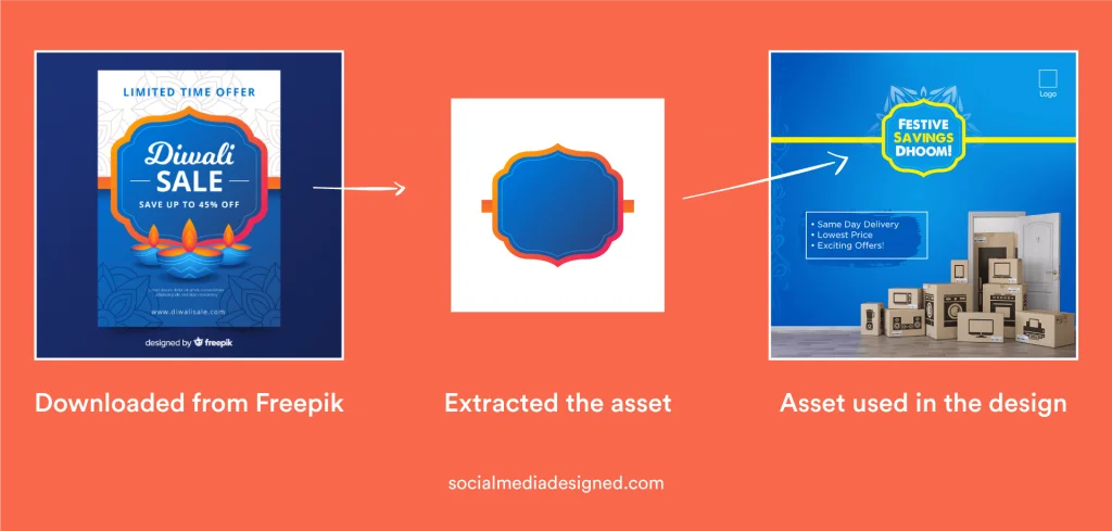
I used vector artwork (I have downloaded it from Freepik) to put the viewers’ focus on the text.
Note that I have only taken the artwork I needed from the file because copy-pasting doesn’t work here and so I edited that artwork in such a way that it fits in the design: I resized it, changed the colors, and extended the hands to fill up the canvas.
The purpose of using that visual asset is to prioritize the focus of the viewer on the text. This is how you can use visual assets to emphasize textual content.
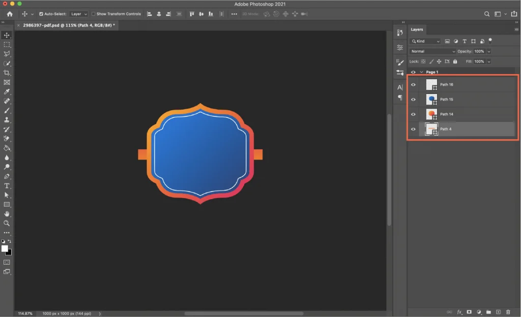
To extract the necessary visual assets from the files you download (if it’s an EPS file or Ai file) you can use Adobe Illustrator and export the necessary layers in Image format and use them in Photoshop. OR
If you don’t have adobe illustrator you can use Photopea which is an online tool. And it’s free.
Go to Photopea.com and open the EPS/AI file and then click on the file menu and click save as PSD.
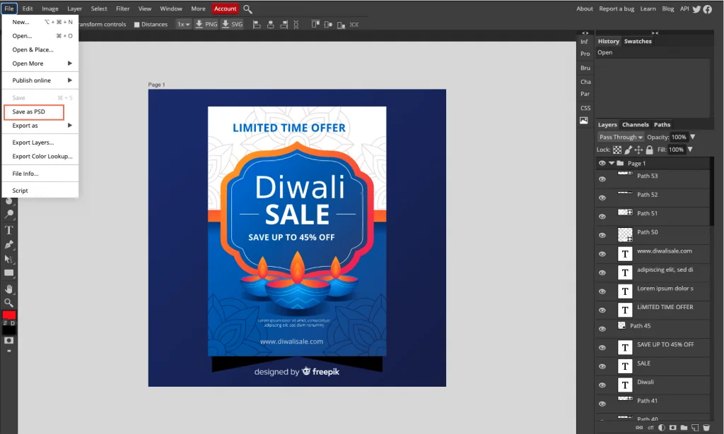
A PSD file with all the layers extracted will be generated and downloaded to your PC. Open it in photoshop and use the necessary layers. This online tool isn’t perfect in separating the layers but works pretty well most of the time.
“Hey, Sujith. What if I don’t use photoshop?”
If you are using Canva/other online tools and don’t have photoshop, go to Photopea, open the PSD file and right-click on the layers that you want to use in your design, and select “Quick Export as PNG”.
Now look at this social media post template that I have designed:
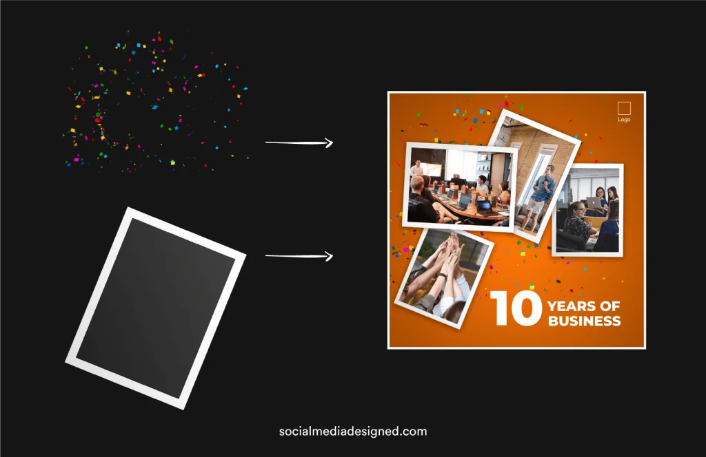
I used polaroid image assets to emphasize the images and the ribbons behind is another visual asset to convey the message of “Celebration”. Vectors (visual assets) are downloaded from free vector image websites and Images are downloaded from free stock image websites.
So this is how you can use visual assets and this is the step where you make your designs attractive. attract = attention.
You don’t need to use visual assets all the time. That’s when you need editing skills. See this post by Canon:
The image is the background here and no visual assets are used to emphasize the text. Instead, they tried editing. It’s so well edited that the text is easily readable. The vignette that is added to the image is so perfect here.
Do you know? On average it takes about seven times of seeing or hearing your brand for someone to recognize it (The Rule Of Seven) and color increases brand recognition by up to 80 percent.
This is why I recommend using brand colors and fonts (if you have any – I think you should have) most of the time. Use the logo on every post. The top right/left is where I prefer to put logos but that’s not a rule. You can call it good practice.
I have talked about why using contrast is essential in step 4. But designing with contrast should be kept in mind while working with backgrounds and visual assets also.
I recommend reading these articles that can give you an in-depth idea of using contrast in designs.
Sometimes the photos you use may not match the design. That’s when you need to adjust the image like cropping, distorting (done rarely), color-correcting it (use can use color filters also), etc.
And that’s it! 6 steps done.
Caution: This 6 step framework isn’t a linear process and it’s not necessary to follow all the steps. It depends on how you want to design and communicate with the assets and information that you have.
By now you might have understood the process I follow while designing. But you know what?
“In the end, we retain from our studies only that which we practically apply”. No, I didn’t say that. Johann Wolfgang Von Goethe said. So let’s see an application of this process with a simple design example.
Why: Posting motivational content should be part of a fitness brand’s social media strategy. The simple answer is to motivate them. What (message): The message is the quote here – “Sore Today Strong Tomorrow”.
I have surfed the internet and found some inspiration (the text alignment, how to highlight text with some visual assets, etc) via some sources that I have mentioned above in Step 2: Get Inspired.
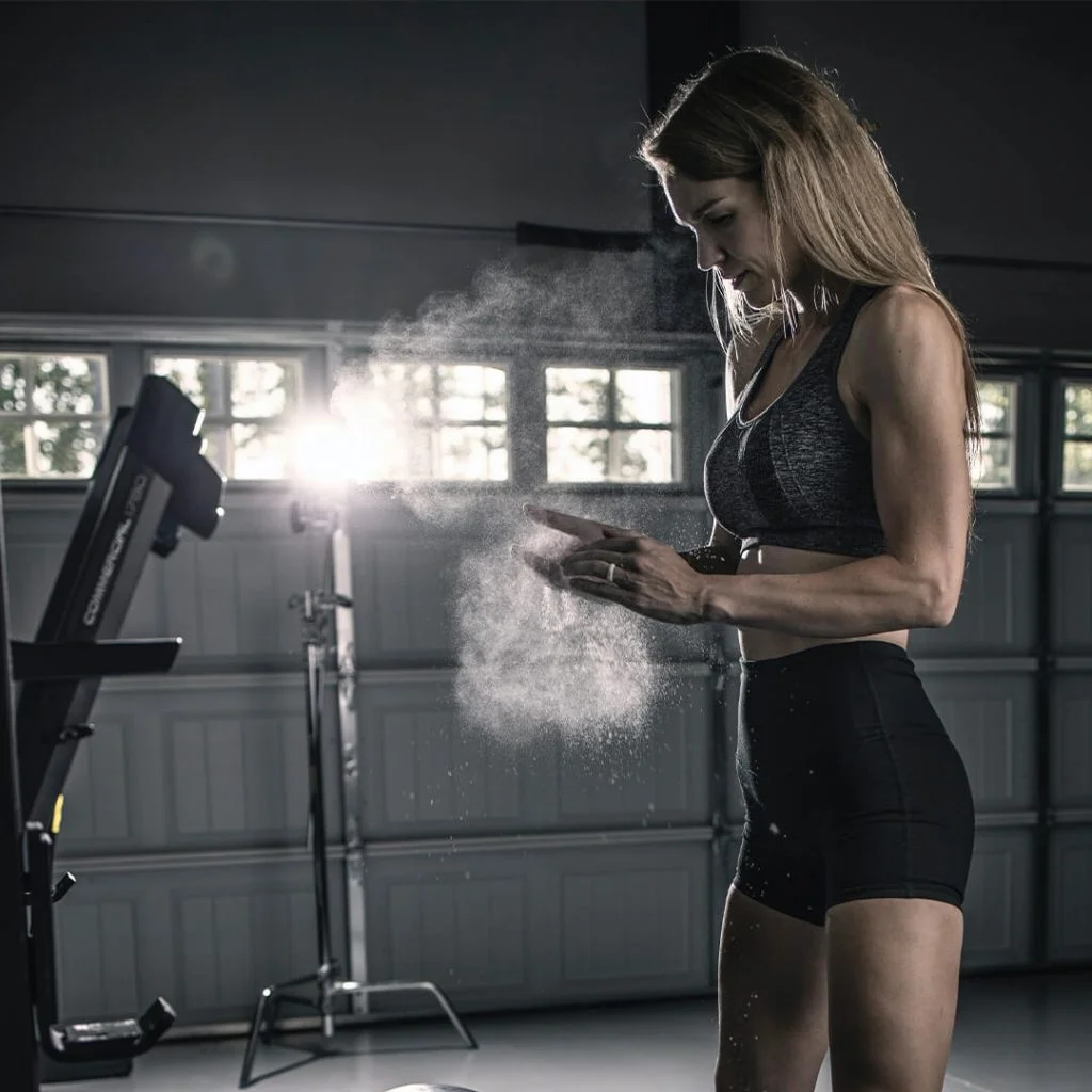
Because I want to convey the message of “Motivation” it makes sense to go with an image rather than a color or some vector background. This is the image (free stock image) I chose as the background.
Writing text. The Alignment, highlighting, font combinations, etc. I have tried a couple of text layouts and this is what appealed to me.

The font I used is “Helvetica Now Display” in the layout that is highlighted above. And I tried to go with only strokes and reduced the fill to ‘0’ for “SORE” and “STRONG”.
And the result is:
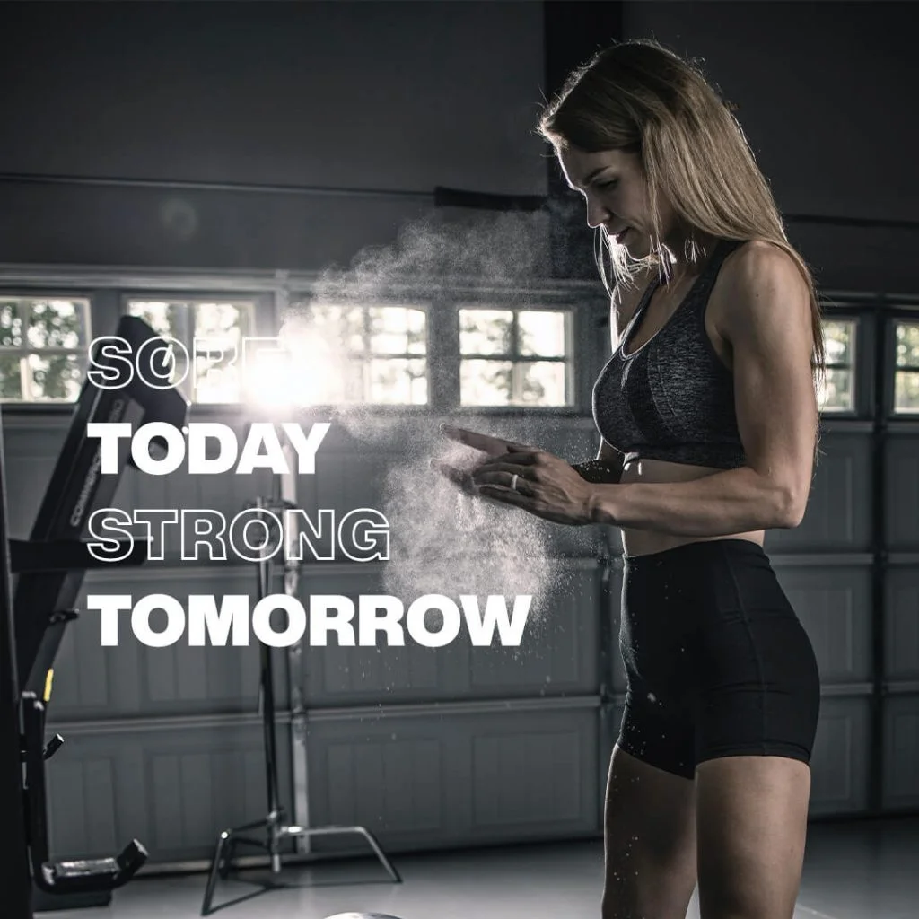
I know what you are thinking: “I can’t even read the text.” That’s when we use visual assets which is the 5th step and one of the most important ones.
See the design now:
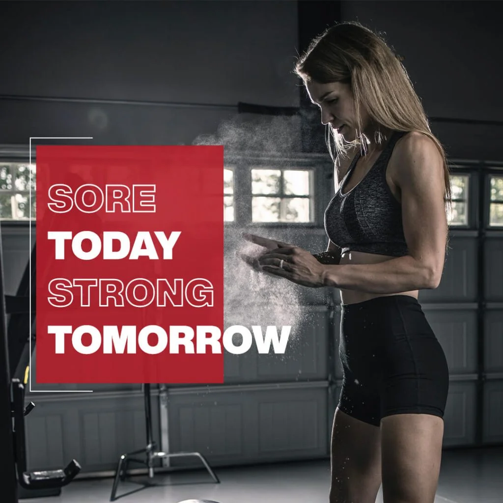
I used a red solid (70% opacity) and a white border (half) to highlight the text layout. Looks good?
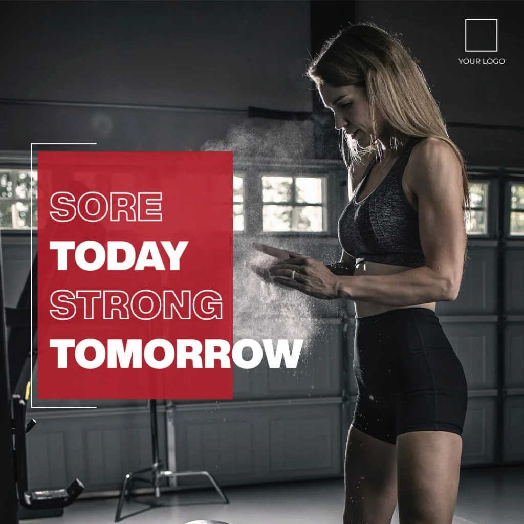
I loved the colors of the image that I have used and so I haven’t gone with any editing. And the contrast is very clear in the design. Anyone who sees this design on a social media feed can easily read the text. And the last thing is the logo which I have added in the top right corner. So here is the final design:
Some best practices you can follow while designing social media posts:
“Creativity is not an inborn skill and can be developed through learning”. I don’t know who said that but it’s true. Design is something that you can learn only by practice. So, PRACTICE! I hope you’ve learned something from this article.
11 Comments
5 Best Ways To Add Text Over Images In Social Media PostsNovember 30, 2020
[…] Also Read: How To Design Social Media Posts: The Complete Guide To Designing Stunning Graphics […]
How To Make Your Instagram Carousels Look BetterNovember 30, 2020
[…] content in this carousel post is taken from a blog post I have written. Although the text isn’t less, I have used visuals to explain the whole thing. Using more […]
3 Reasons Why I Don't Use Canva For Designing Social Media PostsNovember 30, 2020
[…] if not, either learn how to design or hire someone who can design using the […]
How To Design And Use Quote Posts In Your Instagram Marketing StrategyNovember 30, 2020
[…] entire design process is pretty similar to the 6 step framework that I’ve talked about before. And talking about the way of designing a quote post, […]
8 Powerful Designs Tips To Create Eye-Catching Visuals For Social MediaNovember 30, 2020
[…] I’ve already talked about how to design social media posts via the 6 step framework here, I thought that it’s time to talk about a framework to make those graphics better. So, […]
How To Promote Your Youtube Channel On Instagram: Ultimate GuideNovember 30, 2020
[…] done well in the past on youtube into a carousel. For example, I have written a blog post on “How to design social media posts” and later I repurposed that into an Instagram […]
Should I Use (Learn) Canva Or Photoshop To Design Social Media PostsNovember 30, 2020
[…] you a marketer or social media manager or small business owner who is looking to create stunning graphics for social media? Are you a designer who is confused about what tool to use for social media? Well, this article is […]
How To Create Social Media Posts In Photoshop: Beginners GuideNovember 30, 2020
[…] somewhere. Where and How? You can refer to the 6 step design process that I’ve talked about here. But let me make the process […]
How I Learnt Designing Social Media Posts In Photoshop & How You CanNovember 30, 2020
[…] before that, I want you to read the 6 step framework to design social media posts so that you’ll have an idea of where to […]
A Beginners Guide To Adobe Photoshop For Social Media DesigningNovember 30, 2020
[…] I recommend you to learn the design process that I follow while designing social media posts. And after that read this article (skip the basics part as you […]
How To Create Your Own Social Media Templates In PhotoshopNovember 30, 2020
[…] social media design, I’ve already talked about the design framework that I follow. And I’ve also written an article on how to design social media posts in Photoshop. Make sure […]