
Instagram Carousel format has been on a rise, especially in the personal branding space.
From Fitness trainers to Travel bloggers, many are using Instagram carousels to share their stories and educate their audience. We even saw big companies like Pepsi using the carousel format.
If you are looking for a complete guide on how to design a carousel, read this. I have talked about how to format a carousel and how to design a carousel using Photoshop and Illustrator.
And if you are looking to make your carousel designs better… continue reading this article.
So, I have listed 5 main things that you need to perfect to make your Instagram carousels look better.
Good typography is the key to carousel posts.
Always use bold (to grab attention and to make a strong impression) and condensed (because it occupies less space) fonts for headings. And use fonts that fit well on body content (like sans serif fonts).
My favourite font combinations for Instagram carousels are Aku & Kamu (for headings) and Circular Std (for body content).
But here are some font combinations that you can try:
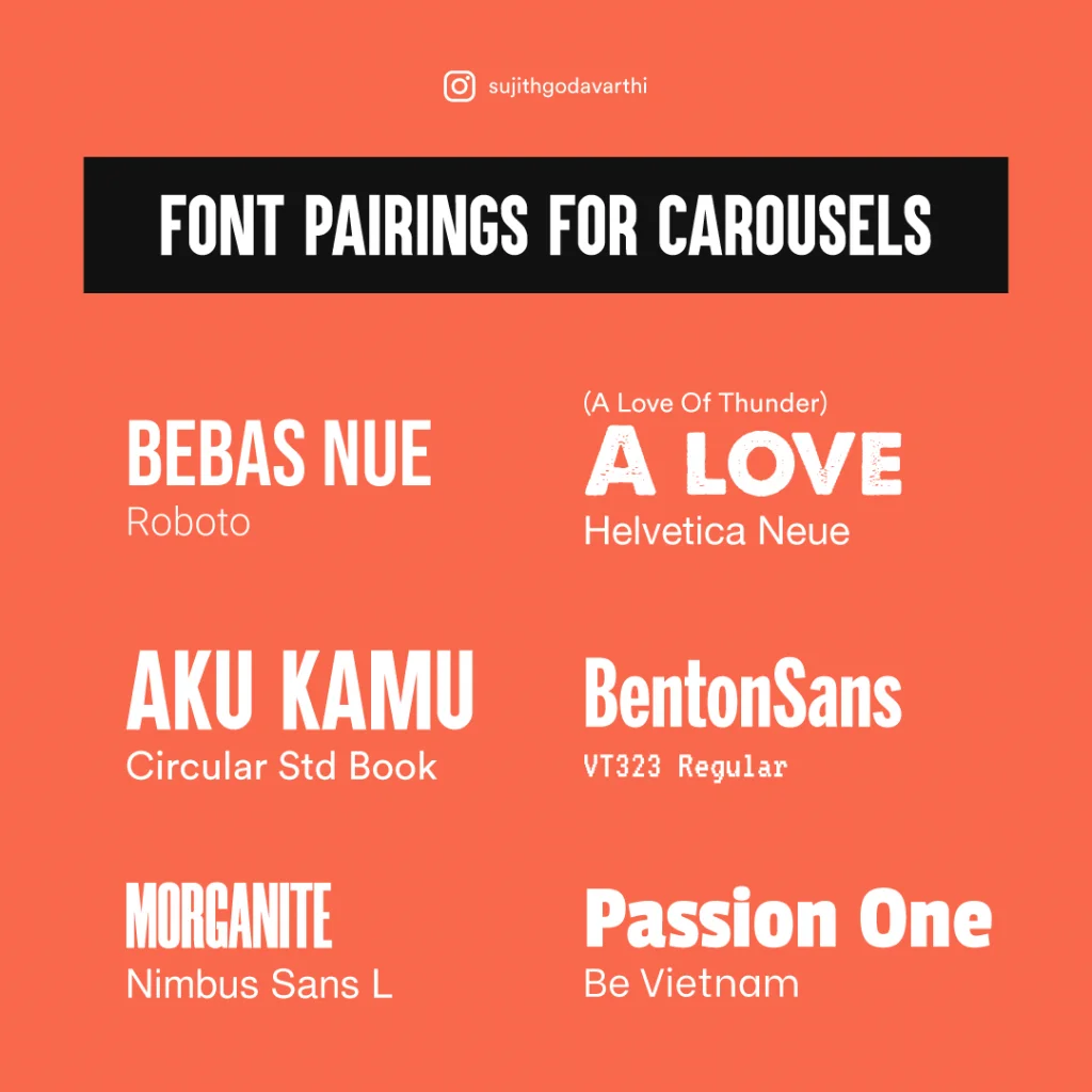
Also, Poppins, Gotham, Heavitas, Monsterrat, Champion Gothic, Poppins, and Morganite are some other popular fonts most Instagram carousel creators use.
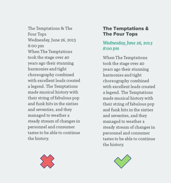
Regarding the text size: Make sure the body text isn’t too small and the heading text isn’t too large in the body content.

And create typographical contrast by varying colors, fonts, or sizes on each slide. Or use shapes.
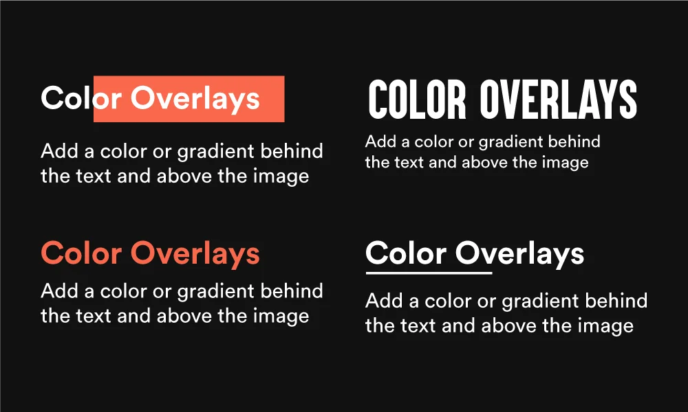
And creating this contrast will not make them wonder what to read first on the slide.
Just because you can make 10 slides doesn’t mean people will consume all the 10 slides.
For them to consume the whole content you need to put less text.
Instagram is a visual platform. So try replacing words with visuals wherever you can.
Look at this carousel:
The content in this carousel post is taken from a blog post I have written.
Although the text isn’t less, I have used visuals to explain the whole thing.
Using more visuals when the text is a bit longer might retain user interest to complete reading the carousel and engage with the content.
Tip: Go with portrait size(1080*1350 pixels) when you have more stuff to fit in the carousel.
I’m gonna give you 3 main design rules (or best practices I’d say) that you can follow to make your carousels look better.
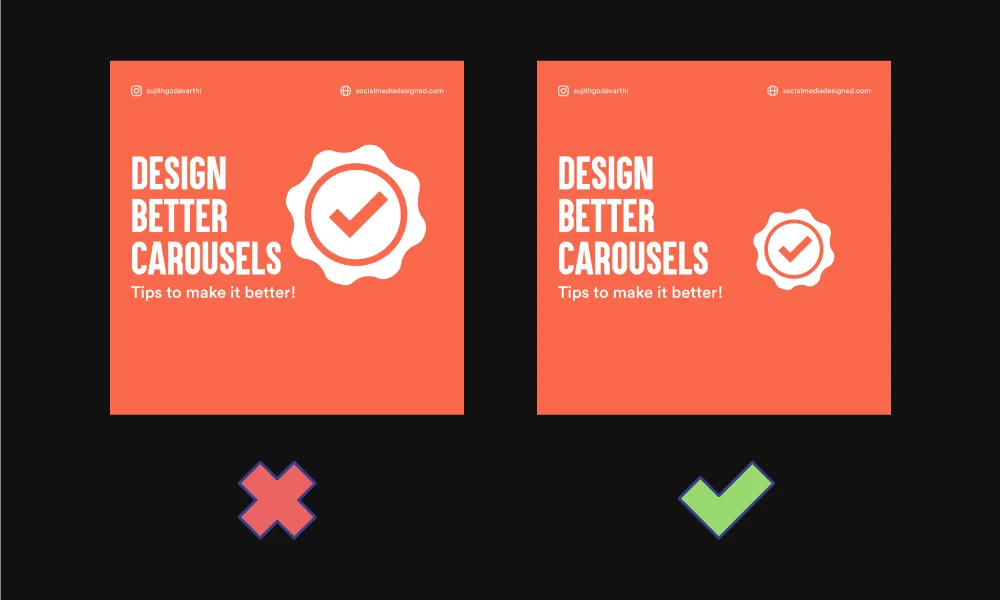
Stop aligning your content to the very corners. I always give a gap of 60px from the left and 150px from the top of the square 1080*1080 pixels.
When in doubt, Align the text to the left side.
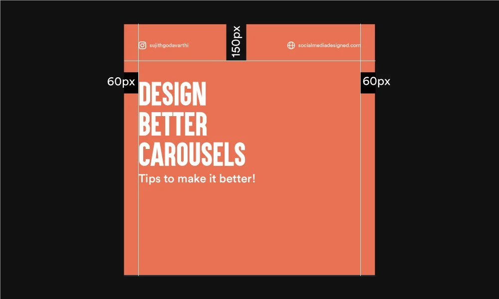
Include the name and website or any other important details that you want your audience to see. Keep the text size low. And use icons. See the image below:
I generally add details at the top (150px area). But you can prefer the bottom too.
If you don’t want to make your design clumsy, concentrate on white space.
Look at this carousel below. The visual aesthetics of all the slides are consistent.
Here is another simple Instagram carousel that I have designed:
All the colors (orange, white, and grey) and fonts (Aku & Kamu and Circular Std) are consistent in each slide or somewhat similar design layout at least. Try to achieve that in your designs.
Maintain visual consistency, not only within the slides but within the whole Instagram feed.
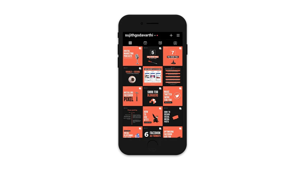
Try using the same set of colors (brand colors) and fonts in all the posts and you’ll achieve consistency in the feed.
Instagram Algorithm will reward you with more reach if you make the users swipe the carousel. So, to make it swipeable, it has to look swipeable. And how do you do it?
By adding a good visual on the first slide. Like this one:
Try to add images that’ll draw attention. And that doesn’t mean you’ll add images and visuals that are good looking but has nothing to do with the content. Add something that resonates with the content.
And try adding shapes or some related visuals in the body if you don’t want your carousels to look too simple. This step is completely optional. And avoid over-decorating.
All it takes is an attractive design and purposeful content to make a carousel successful on Instagram. Redefine your design process till you get better. Oh! Don’t forget to enjoy the process.
Looking for some free carousel templates? Download here.


3 Comments
How To Promote Your Youtube Channel On Instagram: Ultimate GuideFebruary 12, 2021
[…] at his post by Youtuber MostlySane. The carousel design can be as simple as this and the content doesn’t necessarily relate to your youtube niche. It […]
EKONOM.XMC.PLFebruary 12, 2021
Hello Guru, what entice you to post an article. This article was extremely interesting, especially since I was searching for thoughts on this subject last Thursday.
12 Powerful Content Ideas To Build A Personal Brand On InstagramFebruary 12, 2021
[…] 5 Design Tips To Make Your Instagram Carousels Look Better […]