
If you are a marketer leveraging youtube to generate more leads, you need more clicks. If you are a Youtuber, you need more clicks to earn money. So it’s pretty basic that more clicks equals more money.
And what matters more to get clicks is a good Thumbnail. Of course, good content and a better SEO to be found in search results matter too. But you are not here for all that stuff right? So, let’s talk about Thumbnails!
Have you ever heard of the phrase, “Don’t judge a book by its cover”? Well, the Youtube audience won’t follow this. Most will judge the video content by just looking at the Thumbnail itself unless you already have a popular personal brand. All thanks to the new attention span of humans which had dropped from 12 to 8 seconds.
So just remove the thought from your mind that “if the content is good then thumbnail doesn’t really matter”. It matters a lot!
And getting attention on Youtube isn’t easy any more. There is a lot of competition. There is a lot of clutter.
But the good news is we can make the users stop scrolling the feed and grab their attention(or at least improve the chances of them stopping for your thumbnails) by working a bit on the Thumbnail’s design. Let’s see how we can do that:
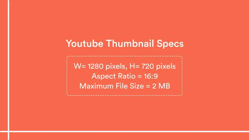
The ideal size (or dimensions) of a Youtube Thumbnail is 1280 x 720 pixels with a 16:9 ratio as per the Youtube guidelines. The image should be less than 2MB and supporting formats are JPG, GIF, and PNG. Make sure you keep these guidelines in mind before starting to design one.
The text and images you choose should give a context of what the users can expect from your video. If you can do that, you will get the attention. That’s why choosing a “Relevant” image is so crucial.
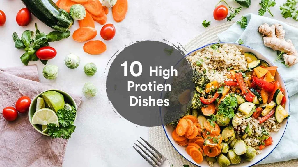
By relevant I mean, if the video is about “Choosing Cardio vs Weight Lifting”, adding someone who is working out in the gym (cardio or weights) makes sense right? If the video is about protein food, a design like this should make sense:
If you are using your own images, which you should especially if you are building a personal brand, then use images with transparent backgrounds, so that you can add some contrasting colors with text. Look at how youtube channels like Social Media Examiner and Income School do it well.
The easy way to use your own PNG’s in the design is to use an online tool like remove.bg that can help remove the background instantly. Once you do this, you can choose a contrasting color and then add the text.
Regarding the text…
Your thumbnail is just as important as your Youtube Video Title to make users click. But that doesn’t mean adding more text on the featured image is a good practice. Shorten the title in a way that it still makes sense and add that in the featured image. What does that mean?
For example, for the title: “How to start a Podcast: A complete guide for Beginners”, you can add the text: “Podcasting For Beginners” in the thumbnail. Something like this:
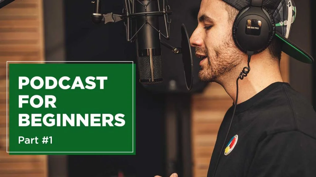
Use visual assets to enhance the content. The reason for using the green background for text in the above image is to highlight. Always choose contrasting colors. I’m talking about the color so contrasting that the users should be able to read it without any difficulty.
Have a look at the Thumbnails on GaryVee’s Youtube Channel:
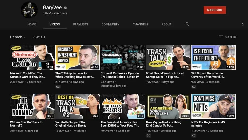
All the text on the thumbnails is written on contrasting backgrounds. And also take note of how the PNG or the transparent images of GaryVee are being used in the thumbnails with different poses and expressions that match the context.
A good thumbnail is all about marrying text with images perfectly.
While you’ll be using text to let the users know what the video is about, you should present it well. A good font can help you do that. Choose bold font for the headings or the main text and choose a font (same or different) with a lower weight if you are using any subheading.

In the thumbnail, for the main text: “How to start a company”, the font used is Cubano. Now, writing a “6 step framework” might be important but not as important as the headline. So, a font (Circular Std) with lower weight is used. That’s how you can create a textual hierarchy.
Talking about colors, see how contrasting the color is in the above design. A user can read the content on the design without any struggle.
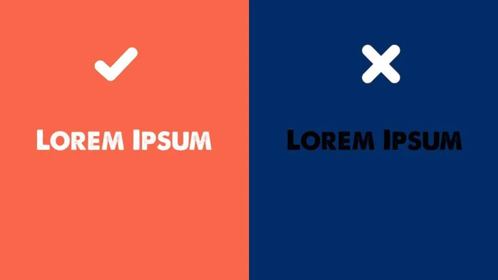
You can even use a online tool like Coolors to check the color contrast.
Another reason for using less text is because the thumbnail appears very small when viewed on mobile. And more than half of YouTube views come from mobile devices. So putting less text, but in bigger size (so that it can be readable via mobile devices too) should be your goal.
Regarding the image, always choose the one with a bigger resolution and adjust it to 1280 pixels * 720 pixels. And anything that’s important should be made big (Zoomed in). Look at the image below:
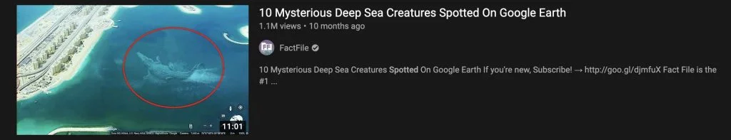
They have zoomed in the image a bit so that the character (Deep sea mysterious creatures that they are talking about) can be made big so that the red marker can be made big. Now when someone views something this big on mobile, they’ll be more tempted to click on it as they’ll recognize it (the character) more easily.
This kind of small change can sometimes do magic to the click-through rates. The video has already crossed a million views on Youtube.
Always brand your thumbnails. It helps you in the long term. Use similar types of colors, same style fonts, or layout styles to visually signal people that it’s your video.
If you do that in the right way, whenever you upload a new video, your subscribers will recognize that it’s your video even without just seeing your channel name and even if the thumbnail doesn’t feature your photo. That’s the power of visual branding.
Look at how Adam Erhart does this with consistent fonts, typography, and colors:

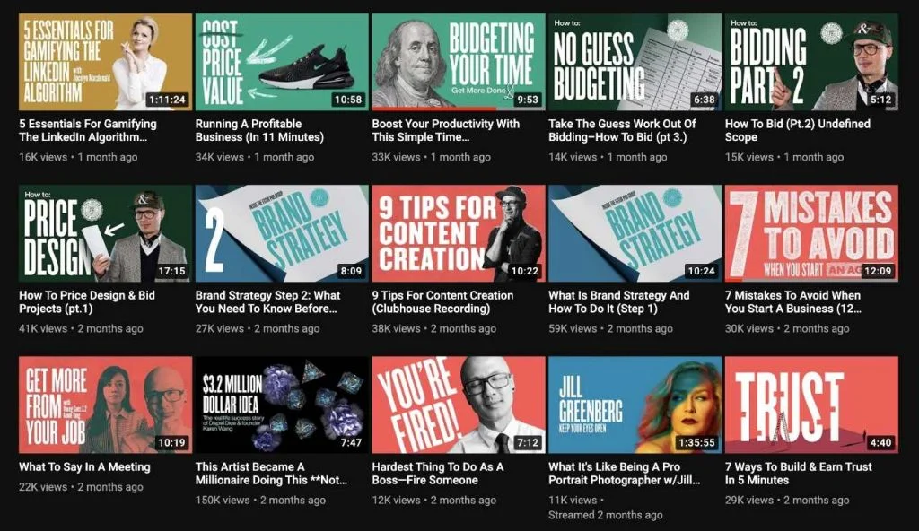
And you don’t need to use the same kind of colors always. You need to have a similar style that people can recognize eventually. Look at how The Futur Youtube channel does it without being “the same” every time. Almost all the thumbnails of this channel are basically a combination of eye-popping color, text, and a PNG image (object or person).
Thumbnail design plays a huge role in CTRs. Try multiple styles and see what’s working. Stick with the ones that are working well for you and develop a similar kind of template. Like we talked about, visual branding can help you in the long term. Make sure you follow the tips and steps that are listed in this article to design a perfect thumbnail.
2 Comments
How To Promote Your Youtube Channel On Instagram: Ultimate GuideApril 5, 2021
[…] need to be consistent with the colors and text that you put on your content. This is the reason why thumbnail design on Youtube and content design on Instagram should be somewhat similar and complement each […]
What Is Social Media Design And How Important It Is In Marketing StrategyApril 5, 2021
[…] on Youtube thumbnail design matters a lot to get clicks, especially in this clickbaity […]